When creating a website, it’s a good idea to design it in a way that makes it more accessible. The goal of web accessibility is to create a website that is usable by everyone, including people with disabilities. This includes implementing features and design elements of a website that cater to their specific needs.
Millions of users rely on websites to be accessible. If you do not consider their needs, they will be unable to use your website. Also, the accessibility of your website has a great impact on SEO, bounce rate, etc. So, prioritizing accessibility not only benefits users but also contributes to the overall success of your website.
The following article lists some important points for better web accessibility to make your website more accessible for users. Before we get started, you might want to check out this free web accessibility testing tool (sponsored by accessiBe). It will show you exactly how accessible your site, and what you’ll need to do to bridge accessibility gaps, if these exist.
Sufficient Color Contrast for Accessibility
The text color and background color combinations with low contrast can be a problem for people with color vision deficiency such as color blindness or low vision.
These users can include elderly people with low sensitivity to color contrast from aging, as well as people who have reading disabilities.
There are many tools to check color contrast ratio such as:
So, it is better for the accessibility of a website to carefully consider the usage of colors and their combinations with an appropriate color contrast ratio.
Keyboard Navigation and Visible Focus State
For visually impaired and blind users, using a mouse to navigate a website can be difficult or nearly impossible. So, they use a keyboard to navigate a website.
Therefore, keyboard navigation is one of the most important points of web accessibility.
Supporting keyboard navigation for a website means all the interactive elements of your website must be accessible with a keyboard. For example, using a Tab key, Shift + Tab keys, Esc key, Enter key, and the arrow keys, etc.
All the interactive elements like links, navigation menus, drop-down menus, sub-menus, forms, input fields, modals, etc. must be accessible by using just a keyboard. For example, users should be able to access a dropdown submenu by using just a keyboard.
Keyboard users make use of the Tab key to navigate the website. When they interact with the element, there must be a distinct and visible focus indicator that clearly shows them the element they are currently on.
Therefore, it is important to provide a visible and distinct keyboard focus indicator on all the interactive elements. Generally, such elements have an outline on focus.
This is one of the accessibility mistakes of removing the focus state like an outline of the interactive elements. So, always make sure to provide a visible focus state for keyboard users to improve your website accessibility.
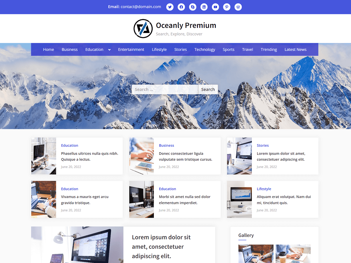
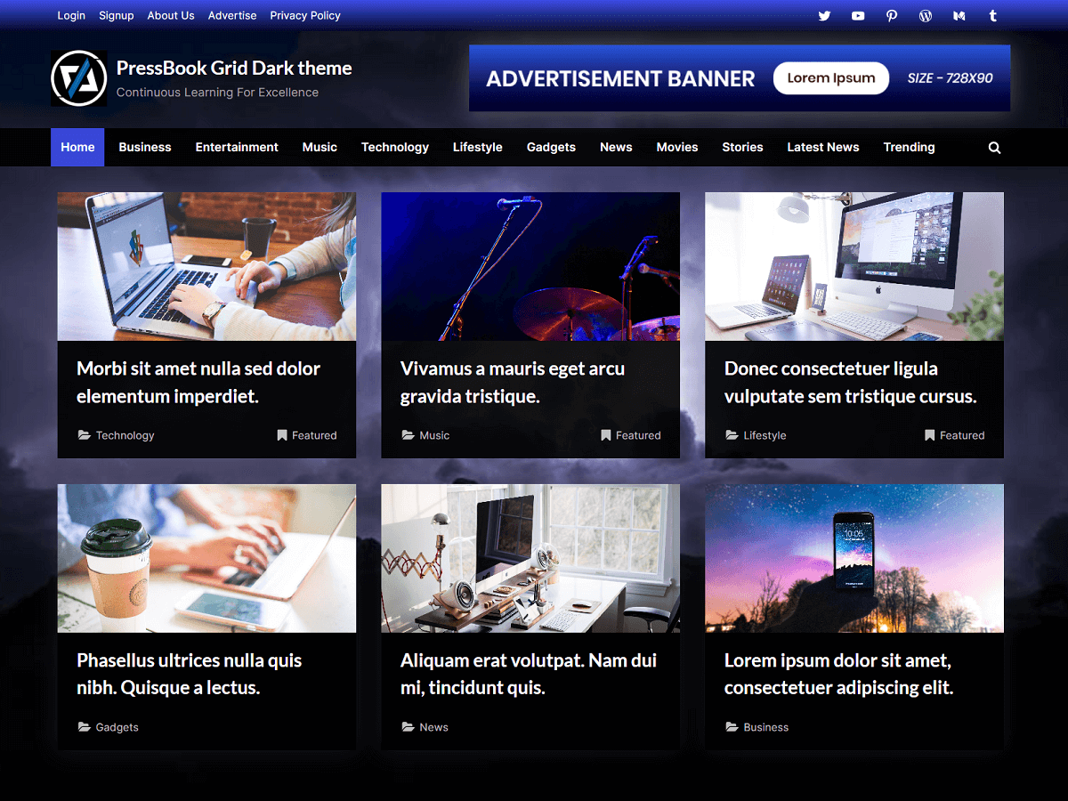
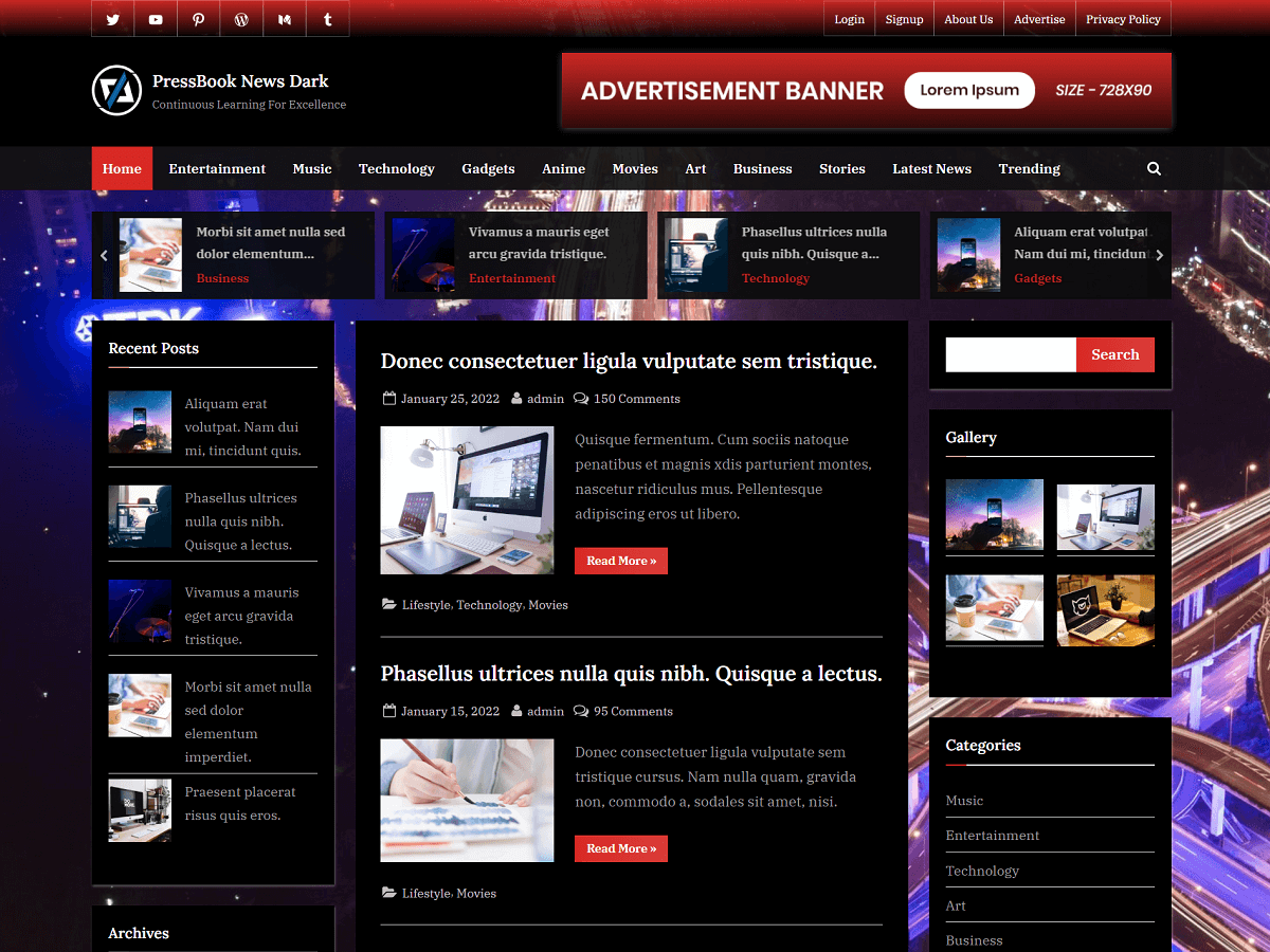
When you select a theme or template for your website, make sure it offers keyboard navigation and a visible focus state for interactive elements. These WordPress themes provide keyboard navigation support for all the interactive elements.
Skip Link to Main Content
Usually, the main content is not the first thing on the web page. There could be header links, a navigation menu, and other interactive elements before the main content.
As a result, the keyboard and screen reader users must navigate through the other elements including navigation links before reaching the main content.
A skip link to the main content can solve this problem. The skip link is the first link on the web page that allows the users to skip through those elements and go directly to the main content section.
Basically, a skip link allows the users to have immediate access to the main content section of any website page. In simple terms, it allows users to easily navigate past irrelevant elements and jump straight to the heart of your web page.
As the best practices, the following points need to be considered:
- A skip link should be the first thing on the web page and should go right after the opening body tag in HTML.
- Style the skip link in a way so it appears only when focussed. This means, that when the user presses the Tab key on the website initially, then the focus can go to the skip link and it becomes visible to the user.
- Include clear text on the link to let the user know what clicking on the skip link does. For example, the link text can be “Skip to content” or “Skip navigation”, etc.
Here’s an example of the HTML structure with the consideration of the skip link:
<body>
  <a class="skip-link screen-reader-text" href="#content">Skip to content</a>

  ...

  <main id="content">...</main>

  ...
</body>
Here’s an example of the screen-reader-text CSS class:
/* Text meant only for screen readers. */
.screen-reader-text {
  border: 0;
  clip: rect(1px, 1px, 1px, 1px);
  -webkit-clip-path: inset(50%);
  clip-path: inset(50%);
  height: 1px;
  margin: -1px;
  overflow: hidden;
  padding: 0;
  position: absolute !important;
  width: 1px;
  word-wrap: normal !important;
}

.screen-reader-text:focus {
  background: #f1f1f1;
  border-radius: 3px;
  box-shadow: 0 0 2px 2px rgba(0, 0, 0, .6);
  clip: auto !important;
  -webkit-clip-path: none;
  clip-path: none;
  color: #21759b;
  display: block;
  font-size: .875rem;
  font-weight: 600;
  height: auto;
  left: 5px;
  line-height: normal;
  padding: 15px 23px 14px;
  text-decoration: none;
  top: 5px;
  width: auto;
  z-index: 100000;
}

/* Do not show the outline on the skip link target. */
#primary[tabindex="-1"]:focus {
  outline: 0;
}
Descriptive Link Text and Alternate Text for Images
To improve the accessibility of a website, every link text on a web page should be descriptive as possible.
Meaningful links help the users to understand the purpose and context of the links before they follow them.
For example, link texts like “Read More” or “Click Here” are unclear. A better way to improve it would be to add more info that is intended for the screen readers. In HTML, it would look something like the following:
<a href="#">Read More<span class="screen-reader-text"> “How to Make a Website More Accessible – Points for Better Accessibility”</span></a>Another important aspect of accessibility is descriptive images. An alternate text for images is a description of the image’s content.
For a site to be accessible, every image should provide an alternate text by filling in the “alt” attribute of the image in HTML.
If your site is using the image for the sole purpose of decoration, only then you don’t need to specify an alternate text.
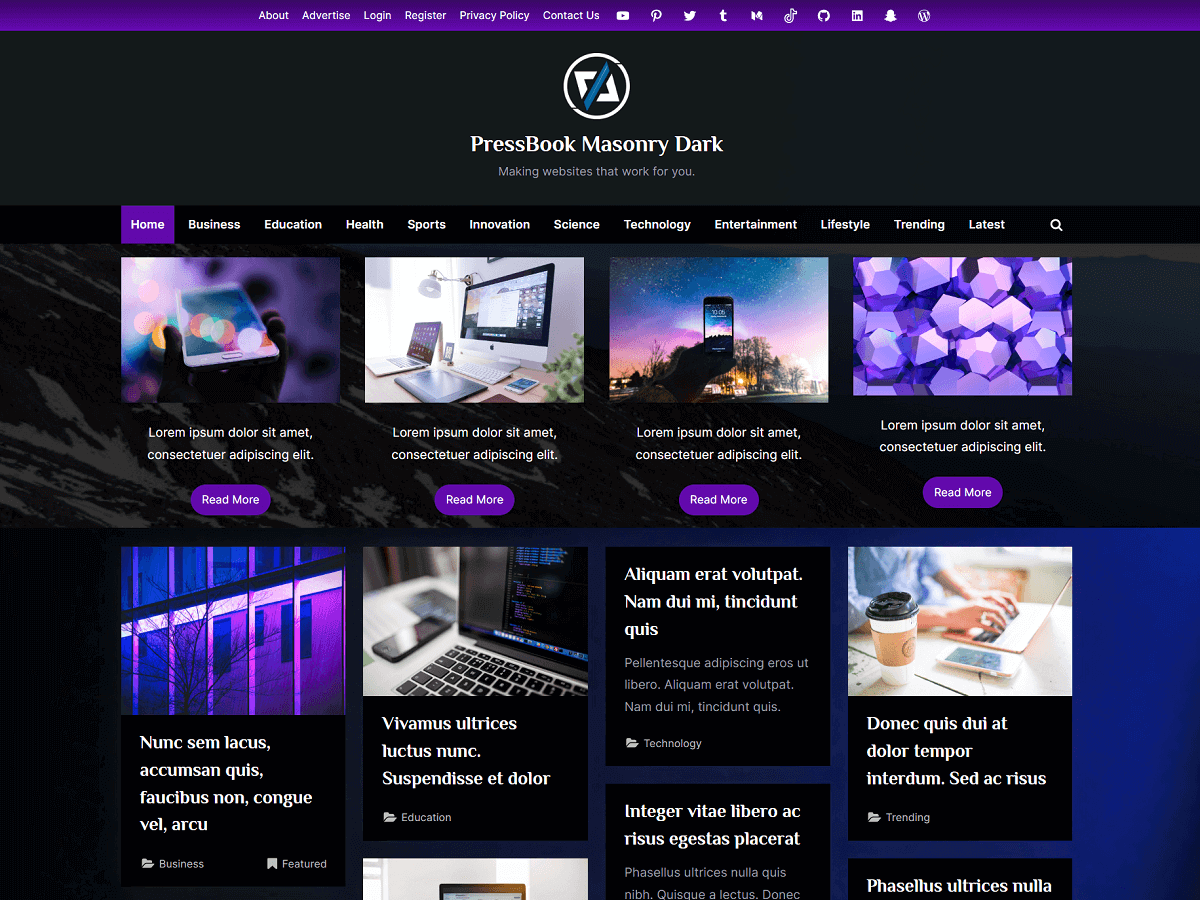
Dark Mode Toggling Feature
Having a dark mode toggling feature on a website can improve accessibility. An appropriate dark background color with a light text color can improve readability and reduce eye strain for many people.
The dark mode switcher is a great accessibility feature to give users the choice to use the website with dark or light colors in the way that is most comfortable for them.
Finally, you can test the accessibility of your website using a screen reader and automated tools such as Lighthouse.
Also, you can test keyboard navigation on your website by navigating through all the interactive elements with just a keyboard.