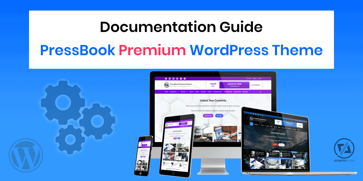
The following guide explores the setup and configuration of the PressBook Premium WordPress theme with dark and light color schemes.
Also, we explore different features that the theme offers.
If you have any questions related to the theme, then you may reach out to us using our contact form. Also, you can refer to frequently asked questions.
Table of Content – PressBook Premium Docs
- 1. Theme Options
- 2. Header Setup
- 2.1. Top Navbar Social Links
- 2.2. Top Navbar Menu
- 2.3. Top Navbar Design and Gradient Colors
- 2.4. Top Info Section – Contact Details and Info Buttons
- 2.5. Branding Area – Site Title, Tagline, and Logo
- 2.6. Top Advertisement Banner
- 2.7. Primary Navigation Menu
- 2.8. Header Background Image
- 2.9. Posts Carousel in Header
- 2.10. Posts Grid in Header
- 2.11. Header Block Areas
- 3. Color Options
- 4. Sidebar Widgets Area
- 4.1. Single Sidebar
- 4.2. Double Sidebars
- 4.3. No Sidebars
- 4.4. Sidebar Options
- 4.5. Block Widgets Screen
- 4.6. Classic Widgets Screen
- 5. Main Content Area
- 5.1. Fonts and Typography Settings
- 5.2. Page Templates
- 5.3. Page Level Settings
- 5.4. Block Patterns
- 5.5. Pattern Block Manager
- 5.6. Single Post Navigation Source
- 5.7. Related Posts Carousel
- 5.8. Related Posts Grid
- 5.9. Blog Posts Grid Layout
- 5.10. Masonry Grid Layout
- 5.11. Custom Front Page
- 5.12. Read More Button and Post Excerpt
- 5.13. Blog Options
- 5.14. Increase Content Area Width for Large Screens
- 6. Footer Setup
- 6.1. Footer Options
- 6.2. Footer Widgets
- 6.3. Posts Carousel in Footer
- 6.4. Footer Block Areas
- 7. Infinite Scroll for Posts with Jetpack Plugin
- 8. Example Configurations
- 8.1. PressBook Blog
- 8.2. PressBook News
- 8.3. PressBook News Dark
- 8.4. PressBook Grid Blogs
- 8.5. PressBook Grid Dark
- 8.6. PressBook Masonry Blogs
- 8.7. PressBook Masonry Dark
- 8.8. PressBook Dark
- 8.9. PressBook Green
- 8.10. PressBook
- 8.11. PressBook Media
- 8.12. Default Options Preset
- 9. Translation of the theme
- 10. Frequently Asked Questions
1. Theme Options
In your WordPress admin area, you can find all the theme options of PressBook Premium in “Appearance” > “Customize”. Using these options, you can configure options like fonts, typography, colors scheme, etc. for your site.
For example, you can change the content area background color from “Content Layout” > “Content Background Color”.
2. Header Setup
The header section of the theme includes the top navbar with social links and a top menu, a top info section with contact details and button links, a branding area with support for background color or background image, an advertisement banner, a primary navigation menu, header block areas, posts carousel, and posts grid.
2.1. Top Navbar Social Links
The theme shows the top bar only when the social links menu or the top menu is set to a display location.
To add social links in the top bar, follow these steps:
- First of all, go to “Appearance” > “Menus”, then create a new menu and assign menu items. Here, the menu items are the custom links.
- For each custom link, enter your social page URL or profile URL with the link text. Then, click on the “Add to Menu” button to add this menu item.
- Next, set the “Display location” to the “Social Links Menu”.
- Finally, click on the “Save Menu” button.
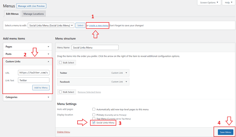
You can add any number of menu items or custom links to the social links menu and it automatically displays the appropriate social icon for the social link.
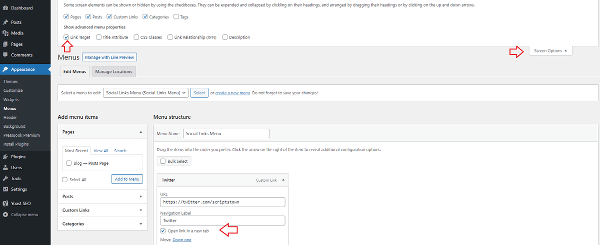
Open Menu Link in a New Tab
You can make any menu link open in a new tab. In “Appearance” > “Menus”, click on “Screen Options” (top-right of the screen). Then, check the option “Link Target”.
This will enable a new option to open links in a new tab for every menu link as shown in the screenshot below.
2.2. Top Navbar Menu
In the same way as the social links menu, you can also create a new menu and assign it to the “Top Menu” display location. In this menu, you can add any menu items like posts, pages, categories, tags, and custom links.
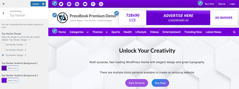
2.3. Top Navbar Design and Gradient Colors
In the premium theme, you can choose from 3 different designs. Also, you can change the gradient background colors of the top navbar.
All these options are available in “Appearance” > “Customize” > “Top Navbar”.
2.4. Top Info Section – Contact Details and Info Buttons
The top info section includes the button links and contact details. Here, the contact detail includes the phone, email, and address.
You can customize the top info section from “Appearance” > “Customize” > “Top Info Section”. This section will show up when you enable either the contact info or the top info buttons.
To enable the contact info, check the “Enable Top Contact Info” option. Similarly, to enable the info buttons, check the “Enable Top Info Buttons”.
Next, you can fill in the details for the contact info as well as for the top info buttons. Here, you can also change the order of contact info fields. For example, you can show the email before the phone number.
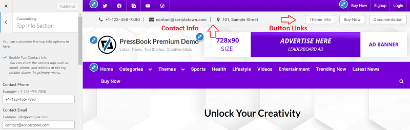
Furthermore, you can configure the background color of the top info section and the text color of the contact info. Similarly, you can also change the background color, border color, and text color for the info buttons.
2.5. Branding Area – Site Title, Tagline, and Logo
The options to configure the site branding area are available in “Appearance” > “Customize” > “Site Identity”. For example, you can only show the logo but hide the site title and tagline. Also, you can set the size of the logo, site title, and tagline for different screen-size devices.
2.6. Top Advertisement Banner
At the top right side of the site branding area, you can show the top advertisement banner. This option is available in “Appearance” > “Customize” > “Top Banner”. The recommended size for the top banner is 728×90.
By default, the top banner is hidden on small-screen devices. You can find the option to hide or show the top banner on small-screen or medium-screen devices in the “Top Banner” section of the theme options.
To put any custom blocks or HTML, including any scripts like Adsense script in the top banner, you can make use of the “Top Banner Block Section” option. This option is available in the “Top Banner” section at the bottom and works similarly to the header block areas. The selected pattern block will appear on the top banner block section, replacing the top banner image and overriding its related options.
2.7. Primary Navigation Menu
This is a multi-level dropdown primary navigation menu that comes with 2 different designs to choose from in the premium theme.
To configure the primary menu, create a new menu in “Appearance” > “Menus”, assign the menu items to this menu, and finally set its display location to the “Primary” just like we have done for the top menu and social links menu.
Also, you can find the designs and color options for the primary menu in “Appearance” > “Customize” > “Primary Navbar”.
2.8. Header Background Image
Find options related to the header image in “Appearance” > “Customize” > “Header Image”.
The options include:
- Header Background Position
- Header Background Repeat
- Header Background Size
If you need to set a minimum height for the site branding header area, you can use the following CSS in “Appearance” > “Customize” > “Additional CSS”:
.site-branding { min-height: 150px; }
@media screen and (min-width: 768px) {
    .site-branding { min-height: 235px; }
}
In the above CSS code, 150px min-height is for small-screen devices and 235px min-height is for large-screen devices. You may change those values as per the need.
2.9. Posts Carousel in Header
The header section just below the primary navbar consists of the header block, posts carousel, and posts grid.
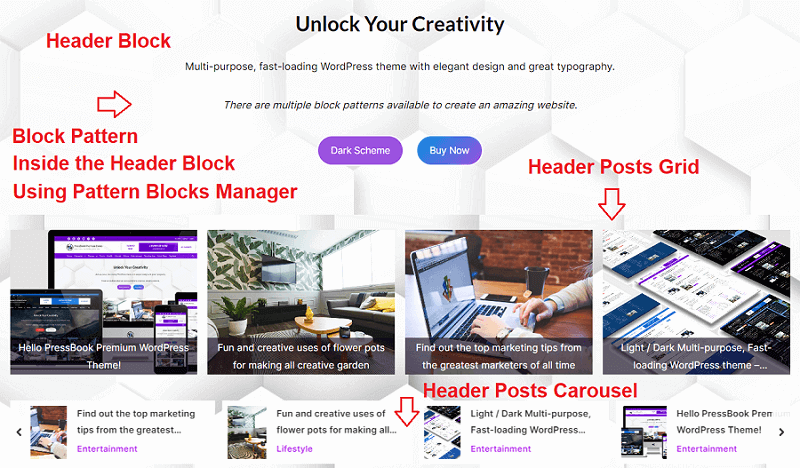
Posts carousel shows the posts based on the source such as categories, tags, and all posts in a configured order such as randomly, modified date, or the latest posts.
PressBook Premium theme allows displaying the posts carousel in the header conditionally. You can find all the related options of the header posts carousels in “Appearance” > “Customize” > “Posts Carousel” > “Header Posts Carousel”.
Here, you can also change the background color and text color of the posts carousel.
Also, you can change the hover background color and text color of the carousel arrow from “Appearance” > “Customize” > “Colors” > “Carousel Arrow Hover Background Color” and “Carousel Arrow Hover Text Color” respectively.
The theme picks up all the featured images of the posts that are shown in the carousel. By default, it uses the cover value in CSS to fit the images. You can also make use of the contain or fill CSS value by using the following CSS in “Customize” > “Additional CSS”:
.carousel-posts .carousel-post-image { object-fit: fill; }2.10. Posts Grid in Header
The posts grid allows displaying the posts in a grid of 1, 2, 3, 4, and 5. The layout adjusts automatically based on the number of posts retrieved from the selected source such as categories or tags.
You can find the options to enable and configure the header posts grid in “Appearance” > “Customize” > “Posts Grid” > “Header Posts Grid”.
Now, you may want to show the posts grid after the posts carousel in the header. To achieve this, you will simply need to uncheck the “Show Header Posts Grid Before Carousel” option.
2.11. Header Block Areas
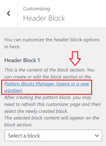
You can use the block area to place any custom content in the header. The premium theme comes with 4 conditional header block areas. To create a header block with custom content, follow these steps:
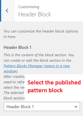
1. First of all, go to “Appearance” > “Customize” > “Header Block”. Here, you will find a link to open the pattern blocks manager. We need to create and publish a pattern block with custom content, then select it in the “Header Block 1”.
2. In the patterns manager screen, click on the “Add New Pattern” button to add a new pattern block. Next, we add custom content to this pattern block.
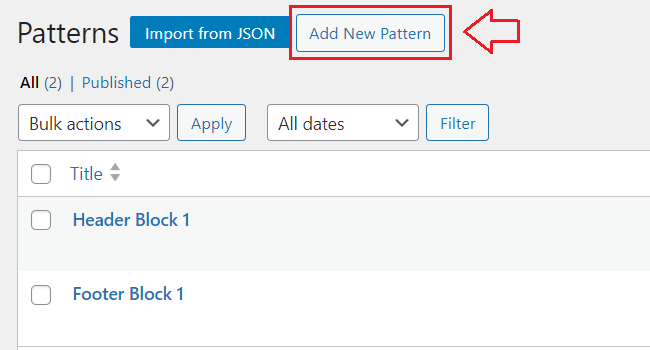
3. You can give this pattern block any title and insert the custom content using the “Blocks” and the “Patterns”. After specifying the content, you can publish this block by clicking on the “Publish” button at the top right.
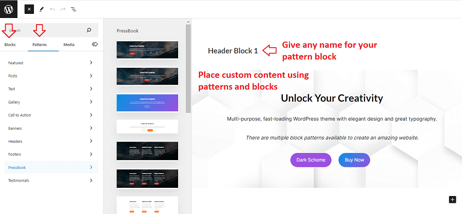
4. Finally, go back to “Appearance” > “Customize” > “Header Block”. You will need to refresh this page in case you don’t see your newly published pattern block in the select input. Here, you can select the block you created in the above step.
Then, the content of this pattern block will appear on the header block area 1. Also, you can show this header block conditionally or in full width. There are many options associated with the individual header block.
In the same way, you can utilize the header blocks 2, 3, and 4.
3. Color Options
You can configure the accent colors for buttons, links, etc. from “Appearance” > “Customize” > “Colors”.
3.1. Header Background and Text Color
This relates to the site branding background color and text color options for the site title and tagline. You can find the header background color option in “Appearance” > “Customize” > “Colors”. The following color options relate to the header branding section:
- Header Background Color
- Site Title Color
- Tagline Color
In case you want a background image instead of a background color for the header branding section, then you can add it from “Appearance” > “Customize” > “Header Image”. Also, there are other options associated with the site branding header image like background position, background size, etc.
3.2. Body Background Color and Image
You can configure the body background color from “Appearance” > “Customize” > “Colors” > “Background Color”. In case you want an image for the body background, then you can add it from “Appearance” > “Customize” > “Background Image”.
3.3. Content Background and Text Color
The default content background color for the PressBook Premium theme is white. You can change it from “Appearance” > “Customize” > “Content Layout” > “Content Background Color”. Also, you may add transparency to the background color using the alpha value.
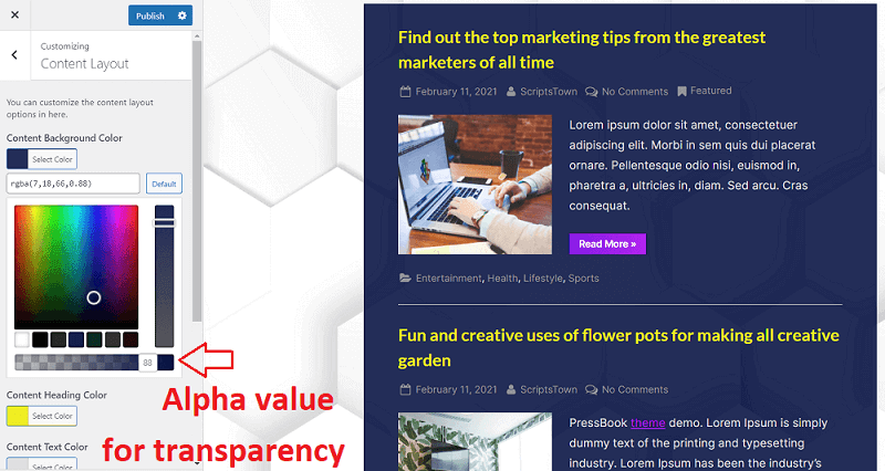
There are many options available for content layout. For example, you may want to check “Remove Horizontal Padding” to remove the padding from the left and right sides of the content area. You may want to do this when the body background color is the same as the content background color.
The background and text colors of the content area are also reflected in the block editor.
For the post meta text color, you can change it from “Appearance” > “Customize” > “Blog Options” > “Post and Comment Meta Text Color”.
3.4. Sidebar Background and Text Color
In a similar manner as the content area, you can also customize the background color and text color of the side widgets of the left and the right sidebars. These options are available in “Appearance” > “Customize” > “Sidebar Layout”.
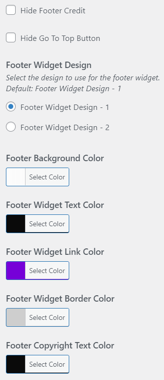
3.5. Footer Background and Text Color
There are many color options available for the footer section in “Appearance” > “Customize” > “Footer Options”. This includes the footer widgets’ background color, text color, link color, border color, etc.
Also, you can customize the back-to-top button color in this section.
4. Sidebar Widgets Area
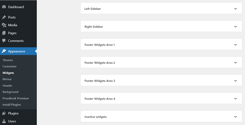
PressBook Premium comes with a left sidebar and the right sidebar. Inside the sidebar, you can place widgets. To see all the sidebar areas, go to “Appearance” > “Widgets”.
Here, you will see the following sidebar widgets areas:
- Left Sidebar
- Right Sidebar
- Footer Widgets Area 1, 2, 3, and 4
This is a block widgets screen. To insert the content in the left sidebar with a widget title and widget content like a paragraph, simply expand the “Left Sidebar” area and insert a “Group” block into it.
Then, inside of the “Group” block, you can insert a heading level 2 or 3. Just after the heading level, but within the “Group” block, you can insert any block like a paragraph block.
The reason we use the “Group” block is to make sure the content with a heading that is the widget title and widget content looks more clear design-wise on the front end.
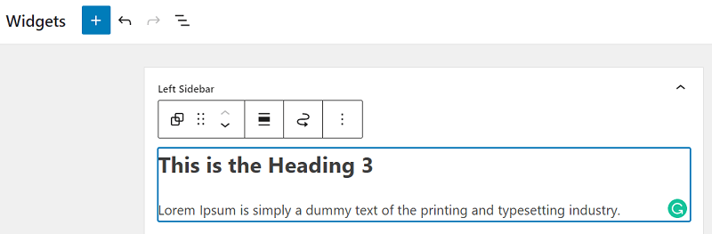
Also, you can use the “List View” of the blocks in order to visualize the positions of different blocks more clearly.
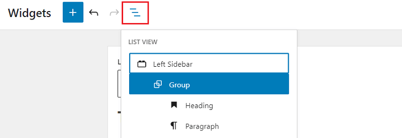
Make sure that the heading and the paragraph blocks are inside of the “Group” block. Similarly, you can place other blocks like image, search, etc. along with the widget title.
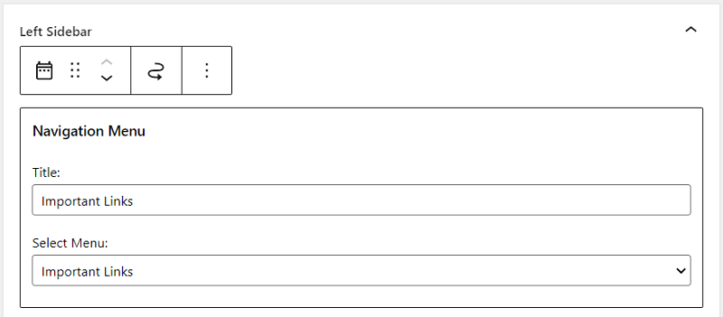
There are other blocks like “Navigation Menu” that don’t require you to separately place a heading block inside the group block. You can simply place the “Navigation Menu” block directly inside of the widgets area without using the “Group” block.
In case you are looking for the classic widgets screen, then you can read below.
4.1. Single Sidebar
The layout of the PressBook Premium theme adjusts automatically depending on if there is a widget in the sidebar.
If you just want a single sidebar, then you will only have to place the widgets inside of the “Right Sidebar” widget area or the “Left Sidebar” widget area, but not both of them. This means you need to make sure that there are blocks only in one of the sidebar areas.
4.2. Double Sidebars
Similarly, the double sidebar appears only if there is at least one widget block in both the left and the right sidebars.
4.3. No Sidebars
Also, if you just want the content area without a sidebar, then you must not place any widgets in the left and right sidebar widgets areas.
4.4. Sidebar Options
You can find all the sidebar-related options from “Appearance” > “Customize” > “Sidebar Layout”. For example, you can disable the sticky-floating behavior of the sidebars by unchecking the “Sticky-Floating Sidebar” option.
4.5. Block Widgets Screen
WordPress comes with a block widgets screen. You can place many different types of blocks into the widgets area, just like you use a block editor to insert the content of posts or pages.
4.6. Classic Widgets Screen
To change the widgets screen from block to classic, you will need to install and activate the Classic Widgets plugin. Using this plugin, you will be able to utilize the more simple widgets screen. The disadvantage of a classic widgets screen is you can’t place varieties of blocks into the widgets area.
5. Main Content Area
5.1. Fonts and Typography Settings
There are many fonts available to choose from for the headings and body text. You can find all the fonts option in “Appearance” > “Customize” > “Fonts & Typography”. Here, the font family you choose also reflects on the editor page along with the front end.
Besides, the font family, you can change the global font size, line height, and font weight.
Also, the premium theme comes with a feature to load any custom Google font. All the instructions are provided in the option description that you can find in “Fonts & Typography” > “Custom Fonts URL”. Using this option, you can load any custom font weight for any fonts that you choose.
It comes with an option to locally host Google fonts, so it is fully compatible with GDPR.
When you choose any font, you may also want to modify the button padding to make it look more perfect with respect to the font and line height. The padding options are available for general buttons and read more buttons that you can find in “Fonts & Typography” > “General Button: Padding” and “Read More Button: Padding”.
5.2. Page Templates
When you create a page or edit a page, you may also want to change its template. There are many page templates available for pages that you can configure for the individual pages.
You can find the “Template” select options in the sidebar area of the page editor screen. The following templates are available for pages:
- Default template
- Full width template
- Large width template
- Medium width template
- Small width template
- Page with sidebar
5.3. Page Level Settings
Besides the page templates, you can also configure the page settings. These settings are also available on the sidebar area of the page editor screen under the section with the label “PressBook Page Settings”.
Using these settings, you can hide the page title, remove top and bottom margins, remove padding, force transparency for the page, etc. Also, these settings are for individual pages.
5.4. Block Patterns
In the editor pages, there are block patterns to choose from. You can find these block patterns in the block inserter that you can toggle using the “+” icon on the page editor screen in order to insert a block.
Also, there are many block patterns available in the “Patterns” tab of the block inserter.
5.5. Pattern Block Manager
When you place multiple blocks and patterns in the editor, you can make them reusable or sync elsewhere by clicking on the 3 dots and then clicking on the “Create pattern” or “Create Reusable block” option.
You can also directly manage all the pattern blocks in the pattern blocks manager screen. To access this screen, go to the welcome page of the theme under “Appearance” > “PressBook Premium”. Then, scroll down and click a button with the label “Pattern Blocks”.
In the theme, we offer to place any pattern blocks in the header or footer section that you can select in “Appearance” > “Customize” > “Header Block” and “Footer Block”.
Also, you can read above in the “Header Block” section of this documentation on how to configure it.
5.6. Single Post Navigation Source
The single post page comes with the post navigation at the bottom of the post content. This shows the previous and next posts with respect to the current post.
You can control the source of posts navigation to “Within Categories” or “Within Tags” from “Appearance” > “Customize” > “Blog Options” > “Single Post Navigation Source”.
By default, the single post navigation source is set to “All Posts”.
5.7. Related Posts Carousel
For the single post page, you can enable the related posts carousel section. Also, you can change the heading for this related posts section in “Appearance” > “Customize” > “Posts Carousel” > “Related Posts Carousel”.
Here, you can select the source for the related posts like single post categories or tags. Also, you can configure the number of related posts and sort the order by the post date or randomly.
5.8. Related Posts Grid
Similar to the related posts carousel, you can also show the related posts grid below the single post. You can find this option in “Appearance” > “Customize” > “Posts Grid” > “Related Posts Grid“.
Here, you can also change the heading of the related posts grid section and configure different options for the source of related posts.
In case you want to show the related posts grid before the related posts carousel in a single post, then you can check the “Show Related Posts Grid Before Carousel” option.
5.9. Blog Posts Grid Layout
If you want to show the blog posts in a grid layout, then you can simply check the “Show Blog Posts in a Grid” option in “Appearance” > “Customize” > “Blog Options”.
When you enable the grid layout, there are more related options available for this layout that you may want to configure. This includes options such as the “Post Card Shadow Effect” and the “Post Card Summary” option.
Also, you can control the number of posts to show in the grid from “Settings” > “Reading” > “Blog pages show at most”. For example, you can change the default value of “10” to “12”.
5.10. Masonry Grid Layout
Note: The masonry grid option is available in PressBook Premium theme version 2.6.0.
To use a masonry grid layout for the blog posts, you will need to check both the “Show Blog Posts in a Grid” and “Use Masonry Layout” options available in “Appearance” > “Customize” < “Blog Options”.
There are multiple options available when you turn on the masonry layout. This includes options like “Columns Margin”, “Number Of Columns”, etc.
You may also want to configure the number of posts on the blog. You can simply change the number of blog posts from WordPress “Settings” > “Reading” > “Blog pages show at most”. For the standard or masonry grid, it is recommended to set this value to “12”.
Along with the masonry grid, you may also want to enable support for loading more posts with a button using the Jetpack plugin.
5.11. Custom Front Page
By default, WordPress shows the blog page on the front page of your website. Instead of a blog page, you can set a custom page for your home page.
To set up a custom front page, go to “Settings” > “Reading”, then set the option “Your homepage displays” to “A static page”. After, you can select any custom page in “Homepage” and set any page for “Posts page” to show the blog posts.
For example, you can create two new pages with the title “Blog” and “Front Page”. Then, set the “Posts page” to “Blog” and “Homepage” to “Front Page”.
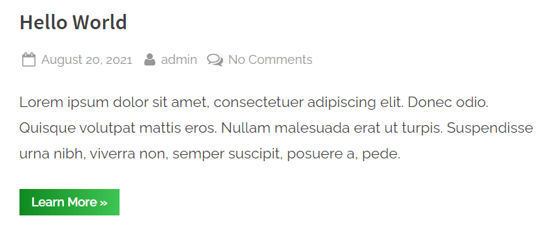
5.12. Read More Button and Post Excerpt
5.12.1. Changing Text for Read More and Adding a Read More Block
You can change the “Read More” button text from “Appearance” > “Customize” > “General Options” > “Read More Text”.
Also, you may want to change where the read more button appears for a post on the blog posts listing page. For this, you can make use of the “More” block in the post editor as shown in the following screenshot:
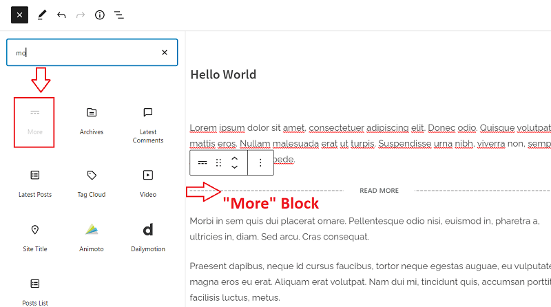
In this way, the more button will appear on the blog listing page depending upon where you place the “More” block in the post editor.
5.12.2. Custom Post Summary or Excerpt in Blog Posts
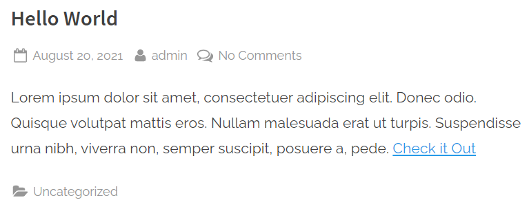
WordPress allows editing excerpts for the posts. An excerpt is a summary of a blog post that is shown on the blog posts listing page. By default, WordPress automatically generates the excerpt of a post.
You can also write a custom excerpt for a post. Go to any post in the editor and on the right side, you will find a text area field to write your own custom excerpt. This will replace the default excerpt generated by WordPress only for this post. Also, you can make use of any HTML tags like an anchor tag, etc.
Here’s an example of what you can write in there:
Your custom excerpt here. You may also want to add a link to your single post page. Here, you can replace the "#" with a link to the single post page (keep the double quotes). Also, you can use HTML <br> tag to make the link go in a new line. <br><a href="#">Check it Out</a>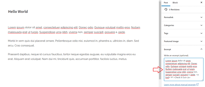
In this way, you can change the excerpt on the blog posts listing page.
5.13. Blog Options
You can find options related to blog posts in “Appearance” > “Customize” > “Blog Options”.
Here, you can use options to hide post meta details like author, date, categories, tags, etc.
- Post Meta: Hide Author
- Post Meta: Hide Date
- Post: Hide Categories
- Post: Hide Tags
You can replace the author’s SVG icon with a profile picture on Gravatar for all post authors using the option “Show Author’s Profile Picture”.
5.14. Increase Main Content Area Width for Large Screens
You can increase the width of main content area using below CSS, depending on whether you use double-sidebar, single-sidebar, or no-sidebar layout.
Case 1: When having double-sidebar layout – Increase main content area width.
Use below CSS in “Appearance” > “Customize” > “Additional CSS”. You can adjust these values “700px”, “760px”, “800px” of content area width for large screen devices.
:root {
  --pb-double-1480-main-w: 700px;
  --pb-double-1600-main-w: 760px;
  --pb-double-1760-main-w: 800px;
  --pb-double-1940-main-w: 800px;
}
@media screen and (min-width: 1480px) {
  body.double-sidebar .u-wrapper {
    max-width: calc(var(--pb-double-1480-main-w) + 660px);
  }
  body.double-sidebar .site-main {
    max-width: var(--pb-double-1480-main-w);
  }
}
@media screen and (min-width: 1600px) {
  body.double-sidebar .u-wrapper {
    max-width: calc(var(--pb-double-1600-main-w) + 660px);
  }
  body.double-sidebar .site-main {
    max-width: var(--pb-double-1600-main-w);
  }
}
@media screen and (min-width: 1760px) {
  body.double-sidebar .u-wrapper {
    max-width: calc(var(--pb-double-1760-main-w) + 660px);
  }
  body.double-sidebar .site-main {
    max-width: var(--pb-double-1760-main-w);
  }
}
@media screen and (min-width: 1940px) {
  body.double-sidebar .u-wrapper {
    max-width: calc(var(--pb-double-1940-main-w) + 660px);
  }
  body.double-sidebar .site-main {
    max-width: var(--pb-double-1940-main-w);
  }
}
Case 2: When having single-sidebar layout – Increase main content area width.
Use below CSS in “Appearance” > “Customize” > “Additional CSS”. You can adjust these values “790px”, “990px”, “1100px”, “1190px” of content area width for large screen devices.
:root {
  --pb-single-1240-main-w: 790px;
  --pb-single-1600-main-w: 990px;
  --pb-single-1760-main-w: 1100px;
  --pb-single-1940-main-w: 1190px;
}
@media screen and (min-width: 1240px) {
  body.single-sidebar .u-wrapper {
    max-width: calc(var(--pb-single-1240-main-w) + 410px);
  }
  body.single-sidebar .site-main {
    max-width: var(--pb-single-1240-main-w);
  }
}
@media screen and (min-width: 1600px) {
  body.single-sidebar .u-wrapper {
    max-width: calc(var(--pb-single-1600-main-w) + 410px);
  }
  body.single-sidebar .site-main {
    max-width: var(--pb-single-1600-main-w);
  }
}
@media screen and (min-width: 1760px) {
  body.single-sidebar .u-wrapper {
    max-width: calc(var(--pb-single-1760-main-w) + 410px);
  }
  body.single-sidebar .site-main {
    max-width: var(--pb-single-1760-main-w);
  }
}
@media screen and (min-width: 1940px) {
  body.single-sidebar .u-wrapper {
    max-width: calc(var(--pb-single-1940-main-w) + 410px);
  }
  body.single-sidebar .site-main {
    max-width: var(--pb-single-1940-main-w);
  }
}
Case 3: When having no-sidebar layout – Increase main content area width.
Use below CSS in “Appearance” > “Customize” > “Additional CSS”. You can adjust these values “800px”, “900px”, “1000px”, “1100px” of content area width for large screen devices. Instead of setting the value in px, you may also use “100%” value for the width.
:root {
  --pb-no-1240-main-w: 800px;
  --pb-no-1600-main-w: 900px;
  --pb-no-1760-main-w: 1000px;
  --pb-no-1940-main-w: 1100px;
}
@media screen and (min-width: 1240px) {
  body.no-sidebar .u-wrapper {
    max-width: calc(var(--pb-no-1240-main-w) + 390px);
  }
  body.no-sidebar .site-main {
    max-width: var(--pb-no-1240-main-w);
  }
}
@media screen and (min-width: 1600px) {
  body.no-sidebar .u-wrapper {
    max-width: calc(var(--pb-no-1600-main-w) + 390px);
  }
  body.no-sidebar .site-main {
    max-width: var(--pb-no-1600-main-w);
  }
}
@media screen and (min-width: 1760px) {
  body.no-sidebar .u-wrapper {
    max-width: calc(var(--pb-no-1760-main-w) + 390px);
  }
  body.no-sidebar .site-main {
    max-width: var(--pb-no-1760-main-w);
  }
}
@media screen and (min-width: 1940px) {
  body.no-sidebar .u-wrapper {
    max-width: calc(var(--pb-no-1940-main-w) + 390px);
  }
  body.no-sidebar .site-main {
    max-width: var(--pb-no-1940-main-w);
  }
}
6. Footer Setup
6.1. Footer Options
You can configure the footer options in “Appearance” > “Customize” > “Footer Options”. Here, you can change the footer widgets’ color, background, border, and text color.
In the premium theme, there are 2 designs available for the footer widgets.
6.2. Footer Widgets
You can place widgets in the footer from “Appearance” > “Widgets”. There are 4 footer widgets areas available in the theme. Similar to the sidebar widgets area, you can add widgets in the footer widgets area.
6.3. Posts Carousel in Footer
Similar to the header posts carousel, you can also show the posts carousel in the footer. The options are available in “Appearance” > “Customize” > “Posts Carousel” > “Footer Posts Carousel”.
Here, you can also configure different options like the source of posts and the number of posts per view in the carousel.
6.4. Footer Block Areas
To show the custom content above the footer widgets area, you may use footer block areas. Similar to the header block areas, you can set the content of the footer block area in “Appearance” > “Customize” > “Footer Block”.
PressBook Premium theme comes with 3 footer block areas that you can show conditionally.
7. Infinite Scroll for Posts with Jetpack Plugin
PressBook Premium comes with support for the load more or infinite scrolling of blog posts with the Jetpack plugin.
You can read the following guide on how to add the infinite scroll for blog posts using the Jetpack plugin.
8. Example Configurations
There are many ways to configure the theme options. Also, you can replicate any of our PressBook themes with a combination of the options that the premium theme offers.
You may use any options preset as a starting point. These options preset are available in “Appearance” > “Options Preset”.
Then, you can easily customize it further using the advanced theme options.
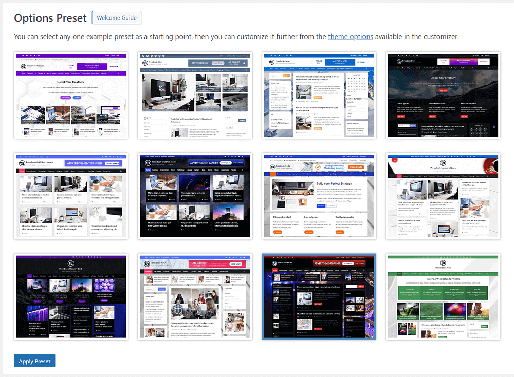
Below are some example configurations for different options. You can find these options in “Appearance” > “Customize”.
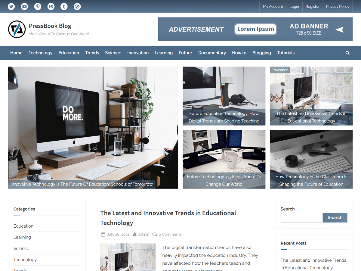
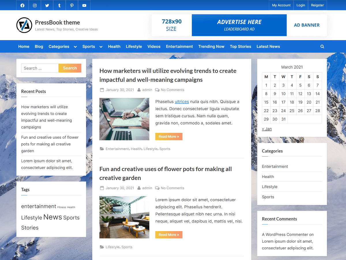
8.1. PressBook Blog
| Option Name | Value |
|---|---|
| Site Identity > Site Branding Layout (Large-Screen Devices) | Left – Right |
| Colors > Background Color | #ffffff |
| Colors > Header Background Color | #ffffff |
| Colors > Site Title Color | #404040 |
| Colors > Tagline Color | #979797 |
| Colors > Link Color | #007a7c |
| Colors > Link Hover Color | #5d7994 |
| Colors > Button Gradient Background 1 | #5d7994 |
| Colors > Button Gradient Background 2 | #6f88a0 |
| Colors > Button Text Color | #ffffff |
| Colors > Carousel Arrow Hover Background Color | #4b6a88 |
| Colors > Carousel Arrow Hover Text Color | #ffffff |
| Fonts & Typography > Heading Font | Source Sans Pro |
| Fonts & Typography > Body Font | Raleway |
| Fonts & Typography > General Button: Padding Top | Default |
| Fonts & Typography > General Button: Padding Bottom | Default |
| Fonts & Typography > Read More Button: Padding Top | 9px |
| Fonts & Typography > Read More Button: Padding Bottom | 8px |
| Top Navbar > Top Navbar Design | Design – 3 |
| Top Navbar > Top Navbar Content Alignment (Large-Screen Devices) | Left – Right |
| Top Navbar > Top Navbar Gradient Background 1 | #5d7994 |
| Top Navbar > Top Navbar Gradient Background 2 | #354a5f |
| Top Info Section > Top Info Background Color | #f3f3f3 |
| Top Info Section > Top Info Text Color | #515151 |
| Top Info Section > Top Info Font Weight | 400 |
| Top Info Section > Top Info: Button Background Color | #ffffff |
| Top Info Section > Top Info: Button Border Color | #a7a7a7 |
| Top Info Section > Top Info: Button Text Color | #515151 |
| Top Info Section > Top Info Button: Padding Top | 0.55em |
| Top Info Section > Top Info Button: Padding Bottom | 0.55em |
| Primary Navbar > Primary Navbar Design | Design – 1 |
| Primary Navbar > Primary Navbar Background Color | #4b6a88 |
| Primary Navbar > Primary Navbar Hover Background Color | #354a5f |
| Primary Navbar > Hide Top Border | Check |
| Primary Navbar > Primary Navbar Text Color | #ffffff |
| Content Layout > Content Background Color | #ffffff |
| Content Layout > Content Heading Color | #404040 |
| Content Layout > Content Text Color | #404040 |
| Sidebar Layout > Side Widget Background Color | #ffffff |
| Sidebar Layout > Side Widget Heading Color | #404040 |
| Sidebar Layout > Side Widget Text Color | #404040 |
| Sidebar Layout > Side Widget Border Color | #fafafa |
| Sidebar Layout > Side Widget Title Border Color | #007a7c |
| Blog Options > Enable Show Blog Posts in a Grid | Uncheck |
| Blog Options > Use Masonry Layout | Uncheck |
| Blog Options > Post and Comment Meta Text Color | #979797 |
| Posts Carousel > Header Posts Carousel > Enable Header Posts Carousel | Check |
| Posts Carousel > Header Posts Carousel > Background Color | #ffffff |
| Posts Carousel > Header Posts Carousel > Text Color | #404040 |
| Posts Carousel > Footer Posts Carousel > Enable Footer Posts Carousel | Check |
| Posts Carousel > Footer Posts Carousel > Background Color | #ffffff |
| Posts Carousel > Footer Posts Carousel > Text Color | #404040 |
| Posts Carousel > Related Posts Carousel > Enable Related Posts Carousel | Check |
| Posts Grid > Header Posts Grid: Enable Header Posts Grid | Check |
| Posts Grid > Header Posts Grid > Empty Image Background Color | #eeeeee |
| Posts Grid > Header Posts Grid > Caption Background Color | rgba(60,85,109,0.55) |
| Posts Grid > Related Posts Grid: Enable Related Posts Grid | Check |
| Posts Grid > Related Posts Grid > Empty Image Background Color | #eeeeee |
| Posts Grid > Related Posts Grid > Caption Background Color | rgba(60,85,109,0.35) |
| Footer Options > Footer Widget Design | Design – 2 |
| Footer Options > Footer Background Color | #0e0e11 |
| Footer Options > Footer Widget Text Color | #ffffff |
| Footer Options > Footer Widget Link Color | #b7b7b7 |
| Footer Options > Footer Widget Border Color | #666666 |
| Footer Options > Footer Copyright Text Color | #e1e1e1 |
| Footer Options > Footer Credit Link Color | #007a7c |
| Footer Options > Go To Top Hover Gradient Color 1 | #445f7a |
| Footer Options > Go To Top Hover Gradient Color 2 | #4b6a88 |
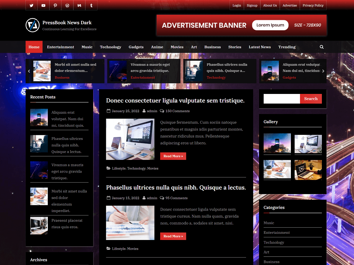
8.2. PressBook News
| Option Name | Value |
|---|---|
| Site Identity > Site Branding Layout (Large-Screen Devices) | Left – Right |
| Colors > Background Color | #ededed |
| Colors > Header Background Color | #ffffff |
| Colors > Site Title Color | #404040 |
| Colors > Tagline Color | #979797 |
| Colors > Link Color | #537cff |
| Colors > Link Hover Color | #ff4056 |
| Colors > Button Gradient Background 1 | #406dff |
| Colors > Button Gradient Background 2 | #537cff |
| Colors > Button Text Color | #ffffff |
| Colors > Carousel Arrow Hover Background Color | #406dff |
| Colors > Carousel Arrow Hover Text Color | #ffffff |
| Fonts & Typography > Heading Font | Lora |
| Fonts & Typography > Body Font | IBM Plex Serif |
| Fonts & Typography > General Button: Padding Top | 6px |
| Fonts & Typography > General Button: Padding Bottom | 8px |
| Fonts & Typography > Read More Button: Padding Top | 8px |
| Fonts & Typography > Read More Button: Padding Bottom | 10px |
| Top Navbar > Top Navbar Design | Design – 2 |
| Top Navbar > Top Navbar Content Alignment (Large-Screen Devices) | Left – Right |
| Top Navbar > Top Navbar Gradient Background 1 | #537cff |
| Top Navbar > Top Navbar Gradient Background 2 | #406dff |
| Top Info Section > Top Info Background Color | #f3f3f3 |
| Top Info Section > Top Info Text Color | #515151 |
| Top Info Section > Top Info Font Weight | 600 |
| Top Info Section > Top Info: Button Background Color | #ffffff |
| Top Info Section > Top Info: Button Border Color | #a7a7a7 |
| Top Info Section > Top Info: Button Text Color | #515151 |
| Top Info Section > Top Info Button: Padding Top | 0.55em |
| Top Info Section > Top Info Button: Padding Bottom | 0.55em |
| Primary Navbar > Primary Navbar Design | Design – 2 |
| Primary Navbar > Primary Navbar Background Color | #1c1c21 |
| Primary Navbar > Primary Navbar Hover Background Color | #ff4056 |
| Primary Navbar > Hide Top Border | Uncheck |
| Primary Navbar > Primary Navbar Text Color | #ffffff |
| Content Layout > Content Background Color | #ffffff |
| Content Layout > Content Heading Color | #404040 |
| Content Layout > Content Text Color | #404040 |
| Sidebar Layout > Side Widget Background Color | #ffffff |
| Sidebar Layout > Side Widget Heading Color | #404040 |
| Sidebar Layout > Side Widget Text Color | #404040 |
| Sidebar Layout > Side Widget Border Color | #fafafa |
| Sidebar Layout > Side Widget Title Border Color | #537cff |
| Blog Options > Enable Show Blog Posts in a Grid | Uncheck |
| Blog Options > Use Masonry Layout | Uncheck |
| Blog Options > Post and Comment Meta Text Color | #979797 |
| Posts Carousel > Header Posts Carousel > Enable Header Posts Carousel | Check |
| Posts Carousel > Header Posts Carousel > Background Color | #ffffff |
| Posts Carousel > Header Posts Carousel > Text Color | #404040 |
| Posts Carousel > Footer Posts Carousel > Enable Footer Posts Carousel | Check |
| Posts Carousel > Footer Posts Carousel > Background Color | #ffffff |
| Posts Carousel > Footer Posts Carousel > Text Color | #404040 |
| Posts Carousel > Related Posts Carousel > Enable Related Posts Carousel | Check |
| Posts Grid > Header Posts Grid: Enable Header Posts Grid | Check |
| Posts Grid > Header Posts Grid > Empty Image Background Color | #eeeeee |
| Posts Grid > Header Posts Grid > Caption Background Color | rgba(8,12,25,0.6) |
| Posts Grid > Related Posts Grid: Enable Related Posts Grid | Check |
| Posts Grid > Related Posts Grid > Empty Image Background Color | #eeeeee |
| Posts Grid > Related Posts Grid > Caption Background Color | rgba(0,0,0,0.45) |
| Footer Options > Footer Widget Design | Design – 2 |
| Footer Options > Footer Background Color | #0e0e11 |
| Footer Options > Footer Widget Text Color | #ffffff |
| Footer Options > Footer Widget Link Color | #b7b7b7 |
| Footer Options > Footer Widget Border Color | #666666 |
| Footer Options > Footer Copyright Text Color | #e1e1e1 |
| Footer Options > Footer Credit Link Color | #ff4056 |
| Footer Options > Go To Top Hover Gradient Color 1 | #406dff |
| Footer Options > Go To Top Hover Gradient Color 2 | #537cff |
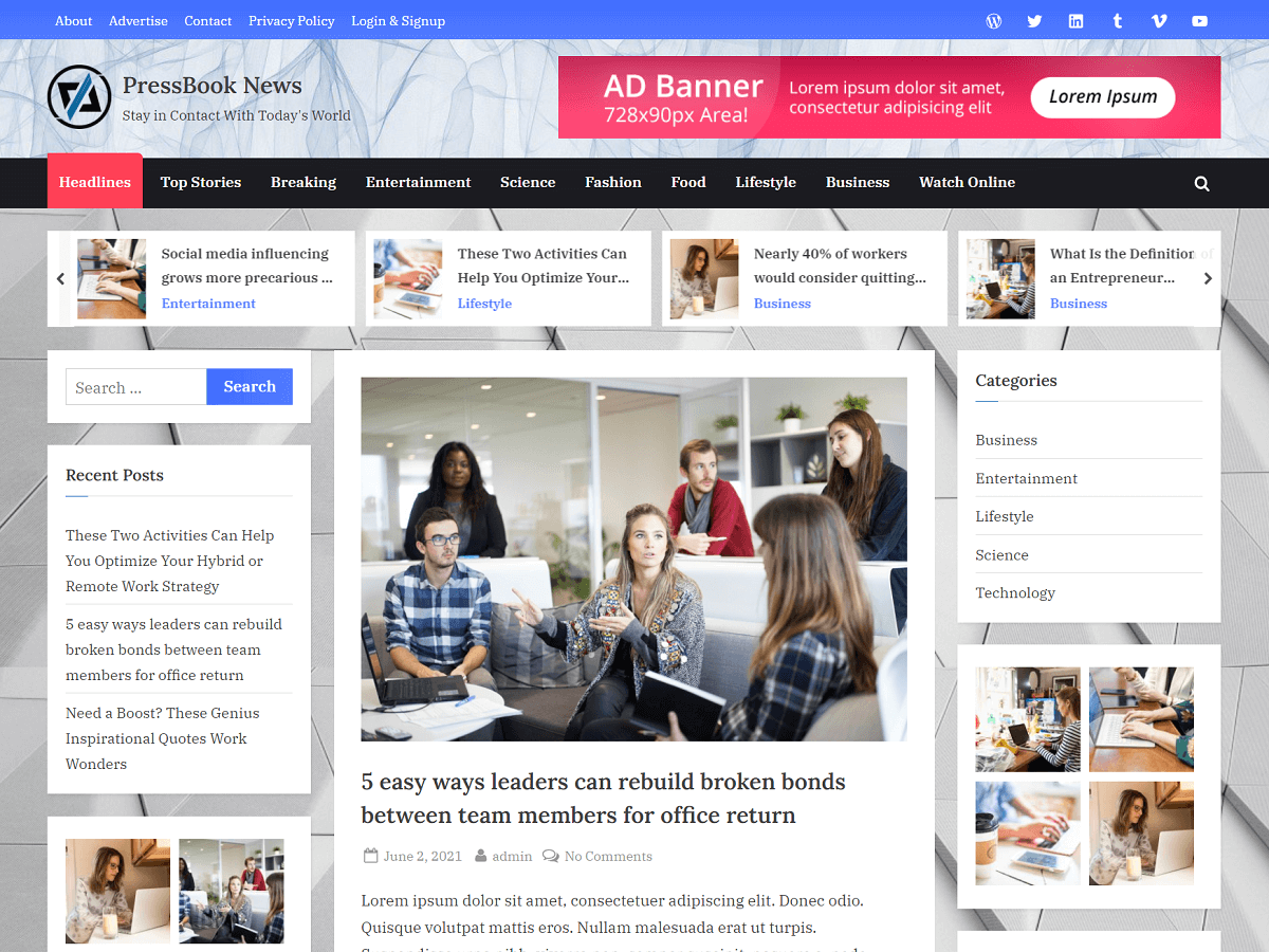
8.3. PressBook News Dark
| Option Name | Value |
|---|---|
| Site Identity > Site Branding Layout (Large-Screen Devices) | Left – Right |
| Colors > Background Color | #000000 |
| Colors > Header Background Color | #000000 |
| Colors > Site Title Color | #ffffff |
| Colors > Tagline Color | #a0a0a0 |
| Colors > Link Color | #d72924 |
| Colors > Link Hover Color | #df5450 |
| Colors > Button Gradient Background 1 | #d72924 |
| Colors > Button Gradient Background 2 | #db3e3a |
| Colors > Button Text Color | #ffffff |
| Colors > Carousel Arrow Hover Background Color | #d72924 |
| Colors > Carousel Arrow Hover Text Color | #ffffff |
| Fonts & Typography > Heading Font | Lora |
| Fonts & Typography > Body Font | IBM Plex Serif |
| Fonts & Typography > General Button: Padding Top | 6px |
| Fonts & Typography > General Button: Padding Bottom | 8px |
| Fonts & Typography > Read More Button: Padding Top | 8px |
| Fonts & Typography > Read More Button: Padding Bottom | 10px |
| Top Navbar > Top Navbar Design | Design – 1 |
| Top Navbar > Top Navbar Content Alignment (Large-Screen Devices) | Left – Right |
| Top Navbar > Top Navbar Gradient Background 1 | rgba(0,0,0,0.92) |
| Top Navbar > Top Navbar Gradient Background 2 | rgba(215,41,36,0.92) |
| Top Info Section > Top Info Background Color | rgba(0,0,0,0.94) |
| Top Info Section > Top Info Text Color | #f4f4f4 |
| Top Info Section > Top Info Font Weight | 400 |
| Top Info Section > Top Info: Button Background Color | rgba(0,0,0,0.9) |
| Top Info Section > Top Info: Button Border Color | rgba(255,255,255,0.8) |
| Top Info Section > Top Info: Button Text Color | #f4f4f4 |
| Top Info Section > Top Info Button: Padding Top | 0.55em |
| Top Info Section > Top Info Button: Padding Bottom | 0.55em |
| Primary Navbar > Primary Navbar Design | Design – 2 |
| Primary Navbar > Primary Navbar Background Color | rgba(17,17,17,0.92) |
| Primary Navbar > Primary Navbar Hover Background Color | #d72924 |
| Primary Navbar > Hide Top Border | Check |
| Primary Navbar > Primary Navbar Text Color | #ffffff |
| Content Layout > Content Background Color | #000000 |
| Content Layout > Content Heading Color | #ffffff |
| Content Layout > Content Text Color | #a0a0a0 |
| Sidebar Layout > Side Widget Background Color | #000000 |
| Sidebar Layout > Side Widget Heading Color | #ffffff |
| Sidebar Layout > Side Widget Text Color | #a0a0a0 |
| Sidebar Layout > Side Widget Border Color | #000000 |
| Sidebar Layout > Side Widget Title Border Color | #d72924 |
| Blog Options > Enable Show Blog Posts in a Grid | Uncheck |
| Blog Options > Use Masonry Layout | Uncheck |
| Blog Options > Post and Comment Meta Text Color | #c0c0c0 |
| Posts Carousel > Header Posts Carousel > Enable Header Posts Carousel | Check |
| Posts Carousel > Header Posts Carousel > Background Color | rgba(12,12,12,0.92) |
| Posts Carousel > Header Posts Carousel > Text Color | #c0c0c0 |
| Posts Carousel > Footer Posts Carousel > Enable Footer Posts Carousel | Check |
| Posts Carousel > Footer Posts Carousel > Background Color | rgba(12,12,12,0.92) |
| Posts Carousel > Footer Posts Carousel > Text Color | #c0c0c0 |
| Posts Carousel > Related Posts Carousel > Enable Related Posts Carousel | Check |
| Posts Grid > Header Posts Grid: Enable Header Posts Grid | Check |
| Posts Grid > Header Posts Grid > Empty Image Background Color | #1e1e1e |
| Posts Grid > Header Posts Grid > Caption Background Color | rgba(22,8,8,0.6) |
| Posts Grid > Related Posts Grid: Enable Related Posts Grid | Check |
| Posts Grid > Related Posts Grid > Empty Image Background Color | #1e1e1e |
| Posts Grid > Related Posts Grid > Caption Background Color | rgba(0,0,0,0.45) |
| Footer Options > Footer Widget Design | Design – 1 |
| Footer Options > Footer Background Color | rgba(12,12,12,0.92) |
| Footer Options > Footer Widget Text Color | #ffffff |
| Footer Options > Footer Widget Link Color | #b7b7b7 |
| Footer Options > Footer Widget Border Color | #666666 |
| Footer Options > Footer Copyright Text Color | #e1e1e1 |
| Footer Options > Footer Credit Link Color | #d72924 |
| Footer Options > Go To Top Hover Gradient Color 1 | #d72924 |
| Footer Options > Go To Top Hover Gradient Color 2 | #e36966 |
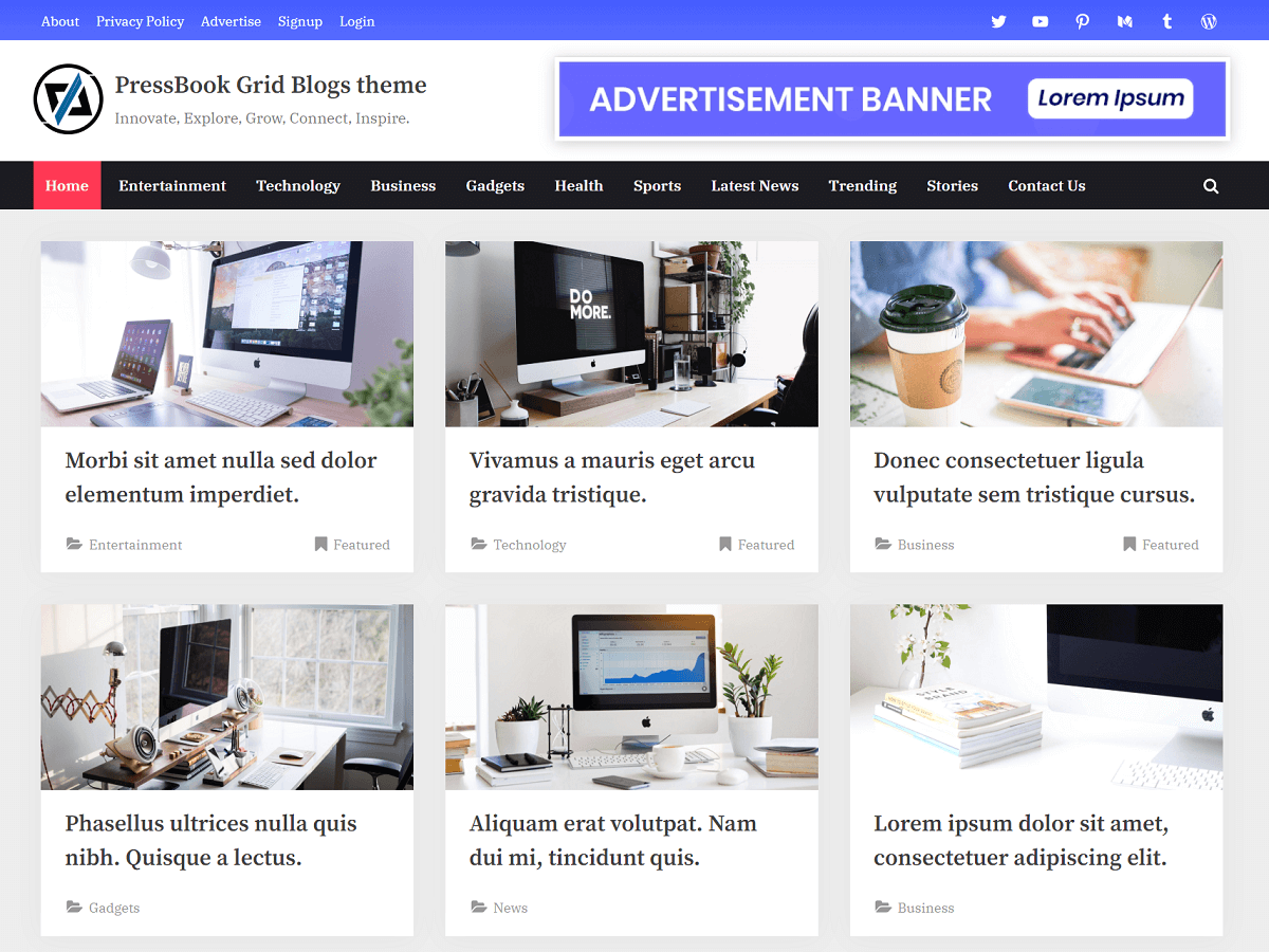
8.4. PressBook Grid Blogs
| Option Name | Value |
|---|---|
| Site Identity > Site Branding Layout (Large-Screen Devices) | Left – Right |
| Colors > Background Color | #ededed |
| Colors > Header Background Color | #ffffff |
| Colors > Site Title Color | #404040 |
| Colors > Tagline Color | #979797 |
| Colors > Link Color | #3369e5 |
| Colors > Link Hover Color | #ff3955 |
| Colors > Button Gradient Background 1 | #455cff |
| Colors > Button Gradient Background 2 | #586cff |
| Colors > Button Text Color | #ffffff |
| Colors > Carousel Arrow Hover Background Color | #3369e5 |
| Colors > Carousel Arrow Hover Text Color | #ffffff |
| Fonts & Typography > Heading Font | Source Serif Pro |
| Fonts & Typography > Body Font | IBM Plex Serif |
| Fonts & Typography > General Button: Padding Top | 6px |
| Fonts & Typography > General Button: Padding Bottom | 8px |
| Fonts & Typography > Read More Button: Padding Top | 8px |
| Fonts & Typography > Read More Button: Padding Bottom | 10px |
| Top Navbar > Top Navbar Design | Design – 2 |
| Top Navbar > Top Navbar Content Alignment (Large-Screen Devices) | Left – Right |
| Top Navbar > Top Navbar Gradient Background 1 | #586cff |
| Top Navbar > Top Navbar Gradient Background 2 | #455cff |
| Top Info Section > Top Info Background Color | #f3f3f3 |
| Top Info Section > Top Info Text Color | #515151 |
| Top Info Section > Top Info Font Weight | 600 |
| Top Info Section > Top Info: Button Background Color | #ffffff |
| Top Info Section > Top Info: Button Border Color | #a7a7a7 |
| Top Info Section > Top Info: Button Text Color | #515151 |
| Top Info Section > Top Info Button: Padding Top | 0.55em |
| Top Info Section > Top Info Button: Padding Bottom | 0.55em |
| Primary Navbar > Primary Navbar Design | Design – 2 |
| Primary Navbar > Primary Navbar Background Color | #1c1c21 |
| Primary Navbar > Primary Navbar Hover Background Color | #ff3955 |
| Primary Navbar > Hide Top Border | Check |
| Primary Navbar > Primary Navbar Text Color | #ffffff |
| Content Layout > Content Background Color | #ffffff |
| Content Layout > Content Heading Color | #404040 |
| Content Layout > Content Text Color | #404040 |
| Sidebar Layout > Side Widget Background Color | #ffffff |
| Sidebar Layout > Side Widget Heading Color | #404040 |
| Sidebar Layout > Side Widget Text Color | #404040 |
| Sidebar Layout > Side Widget Border Color | #fafafa |
| Sidebar Layout > Side Widget Title Border Color | #3369e5 |
| Blog Options > Enable Show Blog Posts in a Grid | Check |
| Blog Options > Use Masonry Layout | Uncheck |
| Blog Options > Post and Comment Meta Text Color | #979797 |
| Posts Carousel > Header Posts Carousel > Enable Header Posts Carousel | Check |
| Posts Carousel > Header Posts Carousel > Background Color | #ffffff |
| Posts Carousel > Header Posts Carousel > Text Color | #404040 |
| Posts Carousel > Footer Posts Carousel > Enable Footer Posts Carousel | Check |
| Posts Carousel > Footer Posts Carousel > Background Color | #ffffff |
| Posts Carousel > Footer Posts Carousel > Text Color | #404040 |
| Posts Carousel > Related Posts Carousel > Enable Related Posts Carousel | Check |
| Posts Grid > Header Posts Grid: Enable Header Posts Grid | Uncheck |
| Posts Grid > Header Posts Grid > Empty Image Background Color | #e3e3e3 |
| Posts Grid > Header Posts Grid > Caption Background Color | rgba(25,6,8,0.6) |
| Posts Grid > Related Posts Grid: Enable Related Posts Grid | Check |
| Posts Grid > Related Posts Grid > Empty Image Background Color | #eeeeee |
| Posts Grid > Related Posts Grid > Caption Background Color | rgba(0,0,0,0.45) |
| Footer Options > Footer Widget Design | Design – 2 |
| Footer Options > Footer Background Color | #0e0e11 |
| Footer Options > Footer Widget Text Color | #ffffff |
| Footer Options > Footer Widget Link Color | #b7b7b7 |
| Footer Options > Footer Widget Border Color | #666666 |
| Footer Options > Footer Copyright Text Color | #e1e1e1 |
| Footer Options > Footer Credit Link Color | #3369e5 |
| Footer Options > Go To Top Hover Gradient Color 1 | #455cff |
| Footer Options > Go To Top Hover Gradient Color 2 | #586cff |
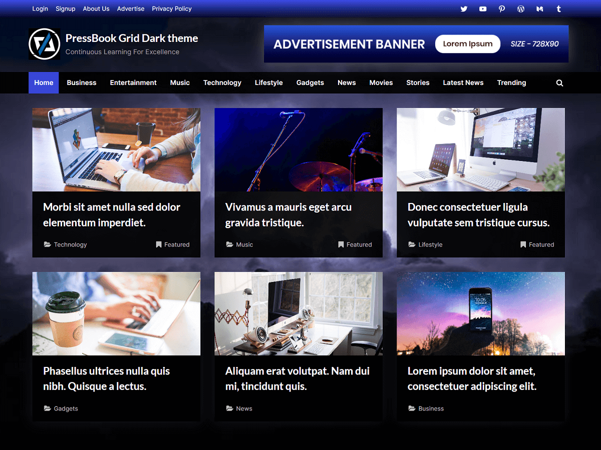
8.5. PressBook Grid Dark
| Option Name | Value |
|---|---|
| Site Identity > Site Branding Layout (Large-Screen Devices) | Left – Right |
| Colors > Background Color | #1e1e1e |
| Colors > Header Background Color | rgba(10,10,10,0.9) |
| Colors > Site Title Color | #ffffff |
| Colors > Tagline Color | #a2a2a2 |
| Colors > Link Color | #5a68e7 |
| Colors > Link Hover Color | #7682eb |
| Colors > Button Gradient Background 1 | #4252e6 |
| Colors > Button Gradient Background 2 | rgba(49,66,228,0.95) |
| Colors > Button Text Color | #ffffff |
| Colors > Carousel Arrow Hover Background Color | #4252e6 |
| Colors > Carousel Arrow Hover Text Color | #ffffff |
| Fonts & Typography > Heading Font | Lato |
| Fonts & Typography > Body Font | Inter |
| Fonts & Typography > General Button: Padding Top | Default |
| Fonts & Typography > General Button: Padding Bottom | Default |
| Fonts & Typography > Read More Button: Padding Top | Default |
| Fonts & Typography > Read More Button: Padding Bottom | Default |
| Top Navbar > Top Navbar Design | Design – 2 |
| Top Navbar > Top Navbar Content Alignment (Large-Screen Devices) | Left – Right |
| Top Navbar > Top Navbar Gradient Background 1 | rgba(6,9,44,0.95) |
| Top Navbar > Top Navbar Gradient Background 2 | #3e4ee6 |
| Top Info Section > Top Info Background Color | rgba(0,0,0,0.94) |
| Top Info Section > Top Info Text Color | #f4f4f4 |
| Top Info Section > Top Info Font Weight | 400 |
| Top Info Section > Top Info: Button Background Color | rgba(0,0,0,0.9) |
| Top Info Section > Top Info: Button Border Color | rgba(255,255,255,0.8) |
| Top Info Section > Top Info: Button Text Color | #f4f4f4 |
| Top Info Section > Top Info Button: Padding Top | 0.55em |
| Top Info Section > Top Info Button: Padding Bottom | 0.55em |
| Primary Navbar > Primary Navbar Design | Design – 2 |
| Primary Navbar > Primary Navbar Background Color | rgba(0,0,0,0.9) |
| Primary Navbar > Primary Navbar Hover Background Color | rgba(57,73,229,0.95) |
| Primary Navbar > Hide Top Border | Check |
| Primary Navbar > Primary Navbar Text Color | #ffffff |
| Content Layout > Content Background Color | rgba(0,0,0,0.91) |
| Content Layout > Content Heading Color | #ffffff |
| Content Layout > Content Text Color | #a2a2a2 |
| Sidebar Layout > Side Widget Background Color | rgba(0,0,0,0.91) |
| Sidebar Layout > Side Widget Heading Color | #ffffff |
| Sidebar Layout > Side Widget Text Color | #a2a2a2 |
| Sidebar Layout > Side Widget Border Color | rgba(0,0,0,0.95) |
| Sidebar Layout > Side Widget Title Border Color | #5a68e7 |
| Blog Options > Enable Show Blog Posts in a Grid | Check |
| Blog Options > Use Masonry Layout | Uncheck |
| Blog Options > Post and Comment Meta Text Color | #c0c0c0 |
| Posts Carousel > Header Posts Carousel > Enable Header Posts Carousel | Check |
| Posts Carousel > Header Posts Carousel > Background Color | rgba(0,0,0,0.91) |
| Posts Carousel > Header Posts Carousel > Text Color | #c0c0c0 |
| Posts Carousel > Footer Posts Carousel > Enable Footer Posts Carousel | Check |
| Posts Carousel > Footer Posts Carousel > Background Color | rgba(0,0,0,0.91) |
| Posts Carousel > Footer Posts Carousel > Text Color | #c0c0c0 |
| Posts Carousel > Related Posts Carousel > Enable Related Posts Carousel | Check |
| Posts Grid > Header Posts Grid: Enable Header Posts Grid | Uncheck |
| Posts Grid > Header Posts Grid > Empty Image Background Color | #1e1e1e |
| Posts Grid > Header Posts Grid > Caption Background Color | rgba(0,0,0,0.45) |
| Posts Grid > Related Posts Grid: Enable Related Posts Grid | Check |
| Posts Grid > Related Posts Grid > Empty Image Background Color | #1e1e1e |
| Posts Grid > Related Posts Grid > Caption Background Color | rgba(0,0,0,0.45) |
| Footer Options > Footer Widget Design | Design – 2 |
| Footer Options > Footer Background Color | rgba(0,0,0,0.93) |
| Footer Options > Footer Widget Text Color | #ffffff |
| Footer Options > Footer Widget Link Color | #b7b7b7 |
| Footer Options > Footer Widget Border Color | #666666 |
| Footer Options > Footer Copyright Text Color | #e1e1e1 |
| Footer Options > Footer Credit Link Color | #7682eb |
| Footer Options > Go To Top Hover Gradient Color 1 | #3949e5 |
| Footer Options > Go To Top Hover Gradient Color 2 | #4f5ee8 |
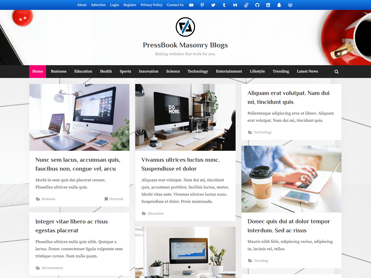
8.6. PressBook Masonry Blogs
| Option Name | Value |
|---|---|
| Site Identity > Site Branding Layout (Large-Screen Devices) | Center |
| Colors > Background Color | #ededed |
| Colors > Header Background Color | #ffffff |
| Colors > Site Title Color | #404040 |
| Colors > Tagline Color | #979797 |
| Colors > Link Color | #1974fc |
| Colors > Link Hover Color | #f70073 |
| Colors > Button Gradient Background 1 | #187df2 |
| Colors > Button Gradient Background 2 | #0968e5 |
| Colors > Button Text Color | #ffffff |
| Colors > Carousel Arrow Hover Background Color | #1974fc |
| Colors > Carousel Arrow Hover Text Color | #ffffff |
| Fonts & Typography > Heading Font | Philosopher |
| Fonts & Typography > Body Font | Source Serif Pro |
| Fonts & Typography > General Button: Padding Top | 7px |
| Fonts & Typography > General Button: Padding Bottom | 7px |
| Fonts & Typography > Read More Button: Padding Top | 10px |
| Fonts & Typography > Read More Button: Padding Bottom | 9px |
| Top Navbar > Top Navbar Design | Design – 2 |
| Top Navbar > Top Navbar Content Alignment (Large-Screen Devices) | Center |
| Top Navbar > Top Navbar Gradient Background 1 | #0968e5 |
| Top Navbar > Top Navbar Gradient Background 2 | #187df2 |
| Top Info Section > Top Info Background Color | #f3f3f3 |
| Top Info Section > Top Info Text Color | #515151 |
| Top Info Section > Top Info Font Weight | 600 |
| Top Info Section > Top Info: Button Background Color | #ffffff |
| Top Info Section > Top Info: Button Border Color | #a7a7a7 |
| Top Info Section > Top Info: Button Text Color | #515151 |
| Top Info Section > Top Info Button: Padding Top | 0.55em |
| Top Info Section > Top Info Button: Padding Bottom | 0.55em |
| Primary Navbar > Primary Navbar Design | Design – 2 |
| Primary Navbar > Primary Navbar Background Color | #232323 |
| Primary Navbar > Primary Navbar Hover Background Color | #f70073 |
| Primary Navbar > Hide Top Border | Check |
| Primary Navbar > Primary Navbar Text Color | #ffffff |
| Content Layout > Content Background Color | #ffffff |
| Content Layout > Content Heading Color | #404040 |
| Content Layout > Content Text Color | #404040 |
| Sidebar Layout > Side Widget Background Color | #ffffff |
| Sidebar Layout > Side Widget Heading Color | #404040 |
| Sidebar Layout > Side Widget Text Color | #404040 |
| Sidebar Layout > Side Widget Border Color | #fafafa |
| Sidebar Layout > Side Widget Title Border Color | #1974fc |
| Blog Options > Enable Show Blog Posts in a Grid | Check |
| Blog Options > Use Masonry Layout | Check |
| Blog Options > Post and Comment Meta Text Color | #979797 |
| Posts Carousel > Header Posts Carousel > Enable Header Posts Carousel | Check |
| Posts Carousel > Header Posts Carousel > Background Color | #ffffff |
| Posts Carousel > Header Posts Carousel > Text Color | #404040 |
| Posts Carousel > Footer Posts Carousel > Enable Footer Posts Carousel | Check |
| Posts Carousel > Footer Posts Carousel > Background Color | #ffffff |
| Posts Carousel > Footer Posts Carousel > Text Color | #404040 |
| Posts Carousel > Related Posts Carousel > Enable Related Posts Carousel | Check |
| Posts Grid > Header Posts Grid: Enable Header Posts Grid | Uncheck |
| Posts Grid > Header Posts Grid > Empty Image Background Color | #e3e3e3 |
| Posts Grid > Header Posts Grid > Caption Background Color | rgba(25,0,11,0.6) |
| Posts Grid > Related Posts Grid: Enable Related Posts Grid | Check |
| Posts Grid > Related Posts Grid > Empty Image Background Color | #eeeeee |
| Posts Grid > Related Posts Grid > Caption Background Color | rgba(0,0,0,0.45) |
| Footer Options > Footer Widget Design | Design – 2 |
| Footer Options > Footer Background Color | #0f0f0f |
| Footer Options > Footer Widget Text Color | #ffffff |
| Footer Options > Footer Widget Link Color | #b7b7b7 |
| Footer Options > Footer Widget Border Color | #666666 |
| Footer Options > Footer Copyright Text Color | #e1e1e1 |
| Footer Options > Footer Credit Link Color | #1974fc |
| Footer Options > Go To Top Hover Gradient Color 1 | #177fe8 |
| Footer Options > Go To Top Hover Gradient Color 2 | #074eba |
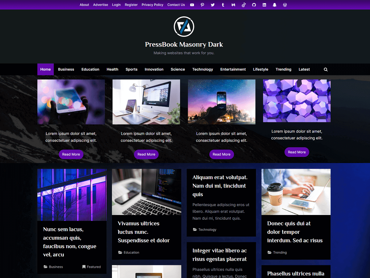
8.7. PressBook Masonry Dark
| Option Name | Value |
|---|---|
| Site Identity > Site Branding Layout (Large-Screen Devices) | Center |
| Colors > Background Color | #1a1a1a |
| Colors > Header Background Color | rgba(20,26,26,0.96) |
| Colors > Site Title Color | #ffffff |
| Colors > Tagline Color | #999fa3 |
| Colors > Link Color | #b57de3 |
| Colors > Link Hover Color | #e558f2 |
| Colors > Button Gradient Background 1 | #5b08a0 |
| Colors > Button Gradient Background 2 | #8023ce |
| Colors > Button Text Color | #ffffff |
| Colors > Carousel Arrow Hover Background Color | #6709b4 |
| Colors > Carousel Arrow Hover Text Color | #ffffff |
| Fonts & Typography > Heading Font | Philosopher |
| Fonts & Typography > Body Font | Inter |
| Fonts & Typography > General Button: Padding Top | Default |
| Fonts & Typography > General Button: Padding Bottom | Default |
| Fonts & Typography > Read More Button: Padding Top | Default |
| Fonts & Typography > Read More Button: Padding Bottom | Default |
| Top Navbar > Top Navbar Design | Design – 2 |
| Top Navbar > Top Navbar Content Alignment (Large-Screen Devices) | Center |
| Top Navbar > Top Navbar Gradient Background 1 | #6709b4 |
| Top Navbar > Top Navbar Gradient Background 2 | #390564 |
| Top Info Section > Top Info Background Color | rgba(0,0,0,0.94) |
| Top Info Section > Top Info Text Color | #f4f4f4 |
| Top Info Section > Top Info Font Weight | 400 |
| Top Info Section > Top Info: Button Background Color | rgba(0,0,0,0.9) |
| Top Info Section > Top Info: Button Border Color | rgba(255,255,255,0.8) |
| Top Info Section > Top Info: Button Text Color | #f4f4f4 |
| Top Info Section > Top Info Button: Padding Top | 0.55em |
| Top Info Section > Top Info Button: Padding Bottom | 0.55em |
| Primary Navbar > Primary Navbar Design | Design – 2 |
| Primary Navbar > Primary Navbar Background Color | rgba(0,0,0,0.9) |
| Primary Navbar > Primary Navbar Hover Background Color | rgba(103,9,180,0.95) |
| Primary Navbar > Hide Top Border | Check |
| Primary Navbar > Primary Navbar Text Color | #ffffff |
| Content Layout > Content Background Color | rgba(0,0,0,0.97) |
| Content Layout > Content Heading Color | #e7e7ef |
| Content Layout > Content Text Color | #999fa3 |
| Sidebar Layout > Side Widget Background Color | rgba(0,0,0,0.97) |
| Sidebar Layout > Side Widget Heading Color | #e7e7ef |
| Sidebar Layout > Side Widget Text Color | #999fa3 |
| Sidebar Layout > Side Widget Border Color | #101010 |
| Sidebar Layout > Side Widget Title Border Color | #b57de3 |
| Blog Options > Enable Show Blog Posts in a Grid | Check |
| Blog Options > Use Masonry Layout | Check |
| Blog Options > Post and Comment Meta Text Color | #b8bcbf |
| Posts Carousel > Header Posts Carousel > Enable Header Posts Carousel | Check |
| Posts Carousel > Header Posts Carousel > Background Color | rgba(0,0,0,0.91) |
| Posts Carousel > Header Posts Carousel > Text Color | #b8bcbf |
| Posts Carousel > Footer Posts Carousel > Enable Footer Posts Carousel | Check |
| Posts Carousel > Footer Posts Carousel > Background Color | rgba(0,0,0,0.91) |
| Posts Carousel > Footer Posts Carousel > Text Color | #b8bcbf |
| Posts Carousel > Related Posts Carousel > Enable Related Posts Carousel | Check |
| Posts Grid > Header Posts Grid: Enable Header Posts Grid | Uncheck |
| Posts Grid > Header Posts Grid > Empty Image Background Color | #1f2021 |
| Posts Grid > Header Posts Grid > Caption Background Color | rgba(0,0,0,0.45) |
| Posts Grid > Related Posts Grid: Enable Related Posts Grid | Check |
| Posts Grid > Related Posts Grid > Empty Image Background Color | #1f2021 |
| Posts Grid > Related Posts Grid > Caption Background Color | rgba(0,0,0,0.45) |
| Footer Options > Footer Widget Design | Design – 2 |
| Footer Options > Footer Background Color | rgba(0,0,0,0.94) |
| Footer Options > Footer Widget Text Color | #ffffff |
| Footer Options > Footer Widget Link Color | #999fa3 |
| Footer Options > Footer Widget Border Color | #666666 |
| Footer Options > Footer Copyright Text Color | #e1e1e1 |
| Footer Options > Footer Credit Link Color | #b57de3 |
| Footer Options > Go To Top Hover Gradient Color 1 | #5b08a0 |
| Footer Options > Go To Top Hover Gradient Color 2 | #8023ce |
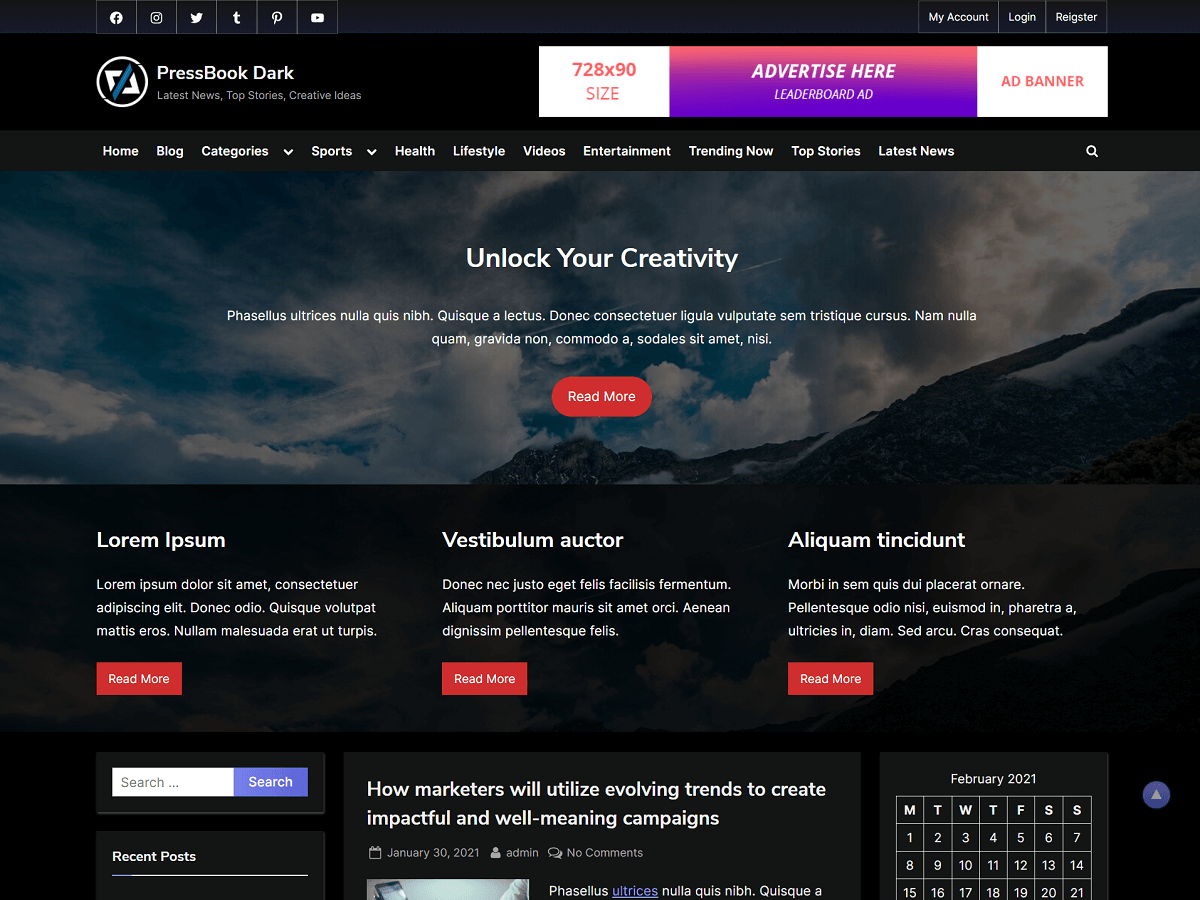
8.8. PressBook Dark
| Option Name | Value |
|---|---|
| Site Identity > Site Branding Layout (Large-Screen Devices) | Left – Right |
| Colors > Background Color | #000000 |
| Colors > Header Background Color | #000000 |
| Colors > Site Title Color | #ffffff |
| Colors > Tagline Color | #a7a7a7 |
| Colors > Link Color | #8f94fb |
| Colors > Link Hover Color | #ff7f7f |
| Colors > Button Gradient Background 1 | #6b72fa |
| Colors > Button Gradient Background 2 | #6067e1 |
| Colors > Button Text Color | #ffffff |
| Colors > Carousel Arrow Hover Background Color | #6b72fa |
| Colors > Carousel Arrow Hover Text Color | #ffffff |
| Fonts & Typography > Heading Font | Playfair Display |
| Fonts & Typography > Body Font | Open Sans |
| Fonts & Typography > General Button: Padding Top | Default |
| Fonts & Typography > General Button: Padding Bottom | Default |
| Fonts & Typography > Read More Button: Padding Top | Default |
| Fonts & Typography > Read More Button: Padding Bottom | Default |
| Top Navbar > Top Navbar Design | Design – 1 |
| Top Navbar > Top Navbar Content Alignment (Large-Screen Devices) | Left – Right |
| Top Navbar > Top Navbar Gradient Background 1 | #181a2f |
| Top Navbar > Top Navbar Gradient Background 2 | #121212 |
| Top Info Section > Top Info Background Color | rgba(0,0,0,0.94) |
| Top Info Section > Top Info Text Color | #f4f4f4 |
| Top Info Section > Top Info Font Weight | 400 |
| Top Info Section > Top Info: Button Background Color | rgba(0,0,0,0.9) |
| Top Info Section > Top Info: Button Border Color | rgba(255,255,255,0.8) |
| Top Info Section > Top Info: Button Text Color | #f4f4f4 |
| Top Info Section > Top Info Button: Padding Top | 0.55em |
| Top Info Section > Top Info Button: Padding Bottom | 0.55em |
| Primary Navbar > Primary Navbar Design | Design – 1 |
| Primary Navbar > Primary Navbar Background Color | #121212 |
| Primary Navbar > Primary Navbar Hover Background Color | #6067e1 |
| Primary Navbar > Hide Top Border | Check |
| Primary Navbar > Primary Navbar Text Color | #ffffff |
| Content Layout > Content Background Color | #121212 |
| Content Layout > Content Heading Color | #ffffff |
| Content Layout > Content Text Color | #b7b7b7 |
| Sidebar Layout > Side Widget Background Color | #121212 |
| Sidebar Layout > Side Widget Heading Color | #ffffff |
| Sidebar Layout > Side Widget Text Color | #b7b7b7 |
| Sidebar Layout > Side Widget Border Color | #121212 |
| Sidebar Layout > Side Widget Title Border Color | #8f94fb |
| Blog Options > Enable Show Blog Posts in a Grid | Uncheck |
| Blog Options > Use Masonry Layout | Uncheck |
| Blog Options > Post and Comment Meta Text Color | #c0c0c0 |
| Posts Carousel > Header Posts Carousel > Enable Header Posts Carousel | Check |
| Posts Carousel > Header Posts Carousel > Background Color | rgba(12,12,12,0.92) |
| Posts Carousel > Header Posts Carousel > Text Color | #c0c0c0 |
| Posts Carousel > Footer Posts Carousel > Enable Footer Posts Carousel | Check |
| Posts Carousel > Footer Posts Carousel > Background Color | rgba(12,12,12,0.92) |
| Posts Carousel > Footer Posts Carousel > Text Color | #c0c0c0 |
| Posts Carousel > Related Posts Carousel > Enable Related Posts Carousel | Check |
| Posts Grid > Header Posts Grid: Enable Header Posts Grid | Check |
| Posts Grid > Header Posts Grid > Empty Image Background Color | #161616 |
| Posts Grid > Header Posts Grid > Caption Background Color | rgba(25,13,13,0.6) |
| Posts Grid > Related Posts Grid: Enable Related Posts Grid | Check |
| Posts Grid > Related Posts Grid > Empty Image Background Color | #161616 |
| Posts Grid > Related Posts Grid > Caption Background Color | rgba(0,0,0,0.45) |
| Footer Options > Footer Widget Design | Design – 1 |
| Footer Options > Footer Background Color | #121212 |
| Footer Options > Footer Widget Text Color | #ffffff |
| Footer Options > Footer Widget Link Color | #b7b7b7 |
| Footer Options > Footer Widget Border Color | #666666 |
| Footer Options > Footer Copyright Text Color | #e1e1e1 |
| Footer Options > Footer Credit Link Color | #ff7f7f |
| Footer Options > Go To Top Hover Gradient Color 1 | #5d63d6 |
| Footer Options > Go To Top Hover Gradient Color 2 | #8f94fb |
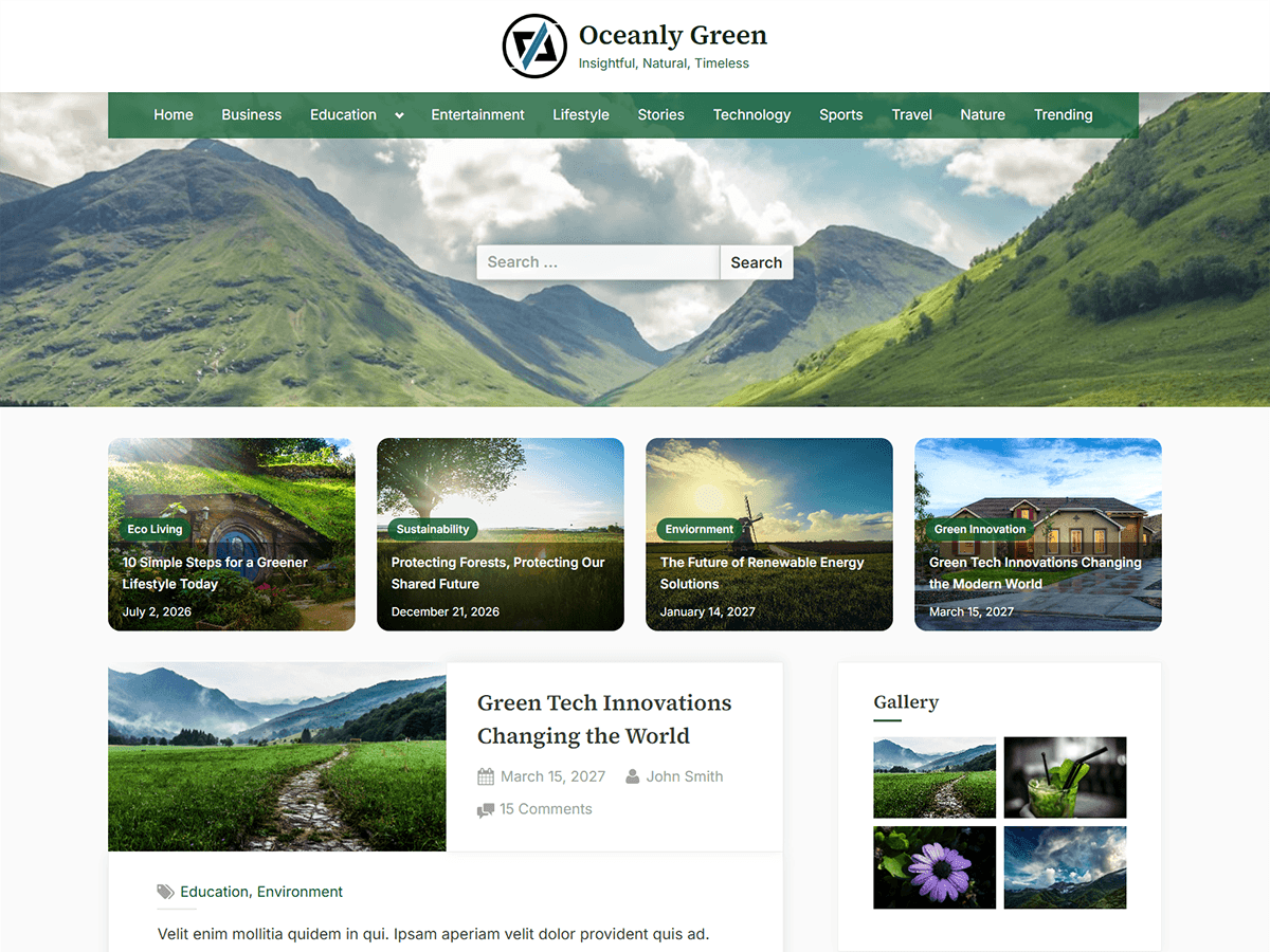
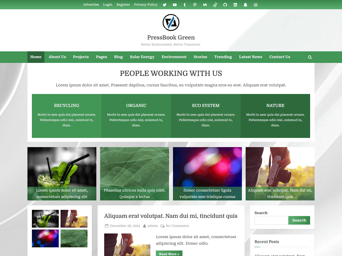
8.9. PressBook Green
| Option Name | Value |
|---|---|
| Site Identity > Site Branding Layout (Large-Screen Devices) | Center |
| Colors > Background Color | #ededed |
| Colors > Header Background Color | #ffffff |
| Colors > Site Title Color | #404040 |
| Colors > Tagline Color | #979797 |
| Colors > Link Color | #255946 |
| Colors > Link Hover Color | #49a760 |
| Colors > Button Gradient Background 1 | #5bb070 |
| Colors > Button Gradient Background 2 | #3a864d |
| Colors > Button Text Color | #ffffff |
| Colors > Carousel Arrow Hover Background Color | #255946 |
| Colors > Carousel Arrow Hover Text Color | #ffffff |
| Fonts & Typography > Heading Font | Domine |
| Fonts & Typography > Body Font | Roboto Serif |
| Fonts & Typography > General Button: Padding Top | Default |
| Fonts & Typography > General Button: Padding Bottom | Default |
| Fonts & Typography > Read More Button: Padding Top | 9px |
| Fonts & Typography > Read More Button: Padding Bottom | 9px |
| Top Navbar > Top Navbar Design | Design – 2 |
| Top Navbar > Top Navbar Content Alignment (Large-Screen Devices) | Center |
| Top Navbar > Top Navbar Gradient Background 1 | #5bb070 |
| Top Navbar > Top Navbar Gradient Background 2 | #3a864d |
| Top Info Section > Top Info Background Color | #f3f3f3 |
| Top Info Section > Top Info Text Color | #515151 |
| Top Info Section > Top Info Font Weight | 600 |
| Top Info Section > Top Info: Button Background Color | #ffffff |
| Top Info Section > Top Info: Button Border Color | #a7a7a7 |
| Top Info Section > Top Info: Button Text Color | #515151 |
| Top Info Section > Top Info Button: Padding Top | 0.55em |
| Top Info Section > Top Info Button: Padding Bottom | 0.55em |
| Primary Navbar > Primary Navbar Design | Design – 2 |
| Primary Navbar > Primary Navbar Background Color | #429656 |
| Primary Navbar > Primary Navbar Hover Background Color | #2c643a |
| Primary Navbar > Hide Top Border | Check |
| Primary Navbar > Primary Navbar Text Color | #ffffff |
| Content Layout > Content Background Color | #ffffff |
| Content Layout > Content Heading Color | #404040 |
| Content Layout > Content Text Color | #404040 |
| Sidebar Layout > Side Widget Background Color | #ffffff |
| Sidebar Layout > Side Widget Heading Color | #404040 |
| Sidebar Layout > Side Widget Text Color | #404040 |
| Sidebar Layout > Side Widget Border Color | #fafafa |
| Sidebar Layout > Side Widget Title Border Color | #49a760 |
| Blog Options > Enable Show Blog Posts in a Grid | Uncheck |
| Blog Options > Use Masonry Layout | Uncheck |
| Blog Options > Post and Comment Meta Text Color | #979797 |
| Posts Carousel > Header Posts Carousel > Enable Header Posts Carousel | Check |
| Posts Carousel > Header Posts Carousel > Background Color | #ffffff |
| Posts Carousel > Header Posts Carousel > Text Color | #404040 |
| Posts Carousel > Footer Posts Carousel > Enable Footer Posts Carousel | Check |
| Posts Carousel > Footer Posts Carousel > Background Color | #ffffff |
| Posts Carousel > Footer Posts Carousel > Text Color | #404040 |
| Posts Carousel > Related Posts Carousel > Enable Related Posts Carousel | Check |
| Posts Grid > Header Posts Grid: Enable Header Posts Grid | Check |
| Posts Grid > Header Posts Grid > Empty Image Background Color | #e2e2e2 |
| Posts Grid > Header Posts Grid > Caption Background Color | rgba(58,134,77,0.67) |
| Posts Grid > Related Posts Grid: Enable Related Posts Grid | Check |
| Posts Grid > Related Posts Grid > Empty Image Background Color | #eeeeee |
| Posts Grid > Related Posts Grid > Caption Background Color | rgba(58,134,77,0.45) |
| Footer Options > Footer Widget Design | Design – 2 |
| Footer Options > Footer Background Color | rgba(255,255,255,0.9) |
| Footer Options > Footer Widget Text Color | #0a0a0a |
| Footer Options > Footer Widget Link Color | #255430 |
| Footer Options > Footer Widget Border Color | #cecece |
| Footer Options > Footer Copyright Text Color | #0a0a0a |
| Footer Options > Footer Credit Link Color | #255430 |
| Footer Options > Go To Top Hover Gradient Color 1 | #49a760 |
| Footer Options > Go To Top Hover Gradient Color 2 | #255946 |
8.10. PressBook
| Option Name | Value |
|---|---|
| Site Identity > Site Branding Layout (Large-Screen Devices) | Left – Right |
| Colors > Background Color | #ededed |
| Colors > Header Background Color | #ffffff |
| Colors > Site Title Color | #404040 |
| Colors > Tagline Color | #979797 |
| Colors > Link Color | #166dd6 |
| Colors > Link Hover Color | #f69275 |
| Colors > Button Gradient Background 1 | #f3c841 |
| Colors > Button Gradient Background 2 | #f69275 |
| Colors > Button Text Color | #ffffff |
| Colors > Carousel Arrow Hover Background Color | #166dd6 |
| Colors > Carousel Arrow Hover Text Color | #ffffff |
| Fonts & Typography > Heading Font | Lato |
| Fonts & Typography > Body Font | Inter |
| Fonts & Typography > General Button: Padding Top | Default |
| Fonts & Typography > General Button: Padding Bottom | Default |
| Fonts & Typography > Read More Button: Padding Top | Default |
| Fonts & Typography > Read More Button: Padding Bottom | Default |
| Top Navbar > Top Navbar Design | Design – 1 |
| Top Navbar > Top Navbar Content Alignment (Large-Screen Devices) | Left – Right |
| Top Navbar > Top Navbar Gradient Background 1 | #166dd6 |
| Top Navbar > Top Navbar Gradient Background 2 | #1257ab |
| Top Info Section > Top Info Background Color | #f3f3f3 |
| Top Info Section > Top Info Text Color | #515151 |
| Top Info Section > Top Info Font Weight | 600 |
| Top Info Section > Top Info: Button Background Color | #ffffff |
| Top Info Section > Top Info: Button Border Color | #a7a7a7 |
| Top Info Section > Top Info: Button Text Color | #515151 |
| Top Info Section > Top Info Button: Padding Top | 0.55em |
| Top Info Section > Top Info Button: Padding Bottom | 0.55em |
| Primary Navbar > Primary Navbar Design | Design – 1 |
| Primary Navbar > Primary Navbar Background Color | #166dd6 |
| Primary Navbar > Primary Navbar Hover Background Color | #f69275 |
| Primary Navbar > Hide Top Border | Check |
| Primary Navbar > Primary Navbar Text Color | #ffffff |
| Content Layout > Content Background Color | #ffffff |
| Content Layout > Content Heading Color | #404040 |
| Content Layout > Content Text Color | #404040 |
| Sidebar Layout > Side Widget Background Color | #ffffff |
| Sidebar Layout > Side Widget Heading Color | #404040 |
| Sidebar Layout > Side Widget Text Color | #404040 |
| Sidebar Layout > Side Widget Border Color | #fafafa |
| Sidebar Layout > Side Widget Title Border Color | #166dd6 |
| Blog Options > Enable Show Blog Posts in a Grid | Uncheck |
| Blog Options > Use Masonry Layout | Uncheck |
| Blog Options > Post and Comment Meta Text Color | #979797 |
| Posts Carousel > Header Posts Carousel > Enable Header Posts Carousel | Check |
| Posts Carousel > Header Posts Carousel > Background Color | #ffffff |
| Posts Carousel > Header Posts Carousel > Text Color | #404040 |
| Posts Carousel > Footer Posts Carousel > Enable Footer Posts Carousel | Check |
| Posts Carousel > Footer Posts Carousel > Background Color | #ffffff |
| Posts Carousel > Footer Posts Carousel > Text Color | #404040 |
| Posts Carousel > Related Posts Carousel > Enable Related Posts Carousel | Check |
| Posts Grid > Header Posts Grid: Enable Header Posts Grid | Check |
| Posts Grid > Header Posts Grid > Empty Image Background Color | #e3e3e3 |
| Posts Grid > Header Posts Grid > Caption Background Color | rgba(2,1,1,0.6) |
| Posts Grid > Related Posts Grid: Enable Related Posts Grid | Check |
| Posts Grid > Related Posts Grid > Empty Image Background Color | #eeeeee |
| Posts Grid > Related Posts Grid > Caption Background Color | rgba(0,0,0,0.45) |
| Footer Options > Footer Widget Design | Design – 1 |
| Footer Options > Footer Background Color | #232323 |
| Footer Options > Footer Widget Text Color | #ffffff |
| Footer Options > Footer Widget Link Color | #b7b7b7 |
| Footer Options > Footer Widget Border Color | #666666 |
| Footer Options > Footer Copyright Text Color | #e1e1e1 |
| Footer Options > Footer Credit Link Color | #f69275 |
| Footer Options > Go To Top Hover Gradient Color 1 | #522db8 |
| Footer Options > Go To Top Hover Gradient Color 2 | #166dd6 |
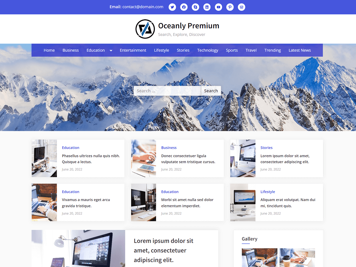
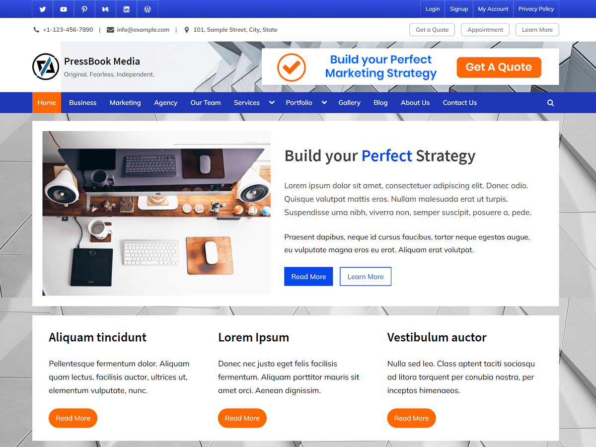
8.11. PressBook Media
| Option Name | Value |
|---|---|
| Site Identity > Site Branding Layout (Large-Screen Devices) | Left – Right |
| Colors > Background Color | #ededed |
| Colors > Header Background Color | #ffffff |
| Colors > Site Title Color | #404040 |
| Colors > Tagline Color | #979797 |
| Colors > Link Color | #094ae9 |
| Colors > Link Hover Color | #a41e6d |
| Colors > Button Gradient Background 1 | #094ae9 |
| Colors > Button Gradient Background 2 | #386be9 |
| Colors > Button Text Color | #ffffff |
| Colors > Carousel Arrow Hover Background Color | #386be9 |
| Colors > Carousel Arrow Hover Text Color | #ffffff |
| Fonts & Typography > Heading Font | Source Sans Pro |
| Fonts & Typography > Body Font | Mulish |
| Fonts & Typography > General Button: Padding Top | Default |
| Fonts & Typography > General Button: Padding Bottom | Default |
| Fonts & Typography > Read More Button: Padding Top | Default |
| Fonts & Typography > Read More Button: Padding Bottom | Default |
| Top Navbar > Top Navbar Design | Design – 1 |
| Top Navbar > Top Navbar Content Alignment (Large-Screen Devices) | Left – Right |
| Top Navbar > Top Navbar Gradient Background 1 | #094ae9 |
| Top Navbar > Top Navbar Gradient Background 2 | #386be9 |
| Top Info Section > Top Info Background Color | #f3f3f3 |
| Top Info Section > Top Info Text Color | #515151 |
| Top Info Section > Top Info Font Weight | 600 |
| Top Info Section > Top Info: Button Background Color | #ffffff |
| Top Info Section > Top Info: Button Border Color | #a7a7a7 |
| Top Info Section > Top Info: Button Text Color | #515151 |
| Top Info Section > Top Info Button: Padding Top | 0.55em |
| Top Info Section > Top Info Button: Padding Bottom | 0.55em |
| Primary Navbar > Primary Navbar Design | Design – 2 |
| Primary Navbar > Primary Navbar Background Color | #1d2327 |
| Primary Navbar > Primary Navbar Hover Background Color | #ff5809 |
| Primary Navbar > Hide Top Border | Check |
| Primary Navbar > Primary Navbar Text Color | #ffffff |
| Content Layout > Content Background Color | #ffffff |
| Content Layout > Content Heading Color | #404040 |
| Content Layout > Content Text Color | #404040 |
| Sidebar Layout > Side Widget Background Color | #ffffff |
| Sidebar Layout > Side Widget Heading Color | #404040 |
| Sidebar Layout > Side Widget Text Color | #404040 |
| Sidebar Layout > Side Widget Border Color | #fafafa |
| Sidebar Layout > Side Widget Title Border Color | #094ae9 |
| Blog Options > Enable Show Blog Posts in a Grid | Uncheck |
| Blog Options > Use Masonry Layout | Uncheck |
| Blog Options > Post and Comment Meta Text Color | #979797 |
| Posts Carousel > Header Posts Carousel > Enable Header Posts Carousel | Check |
| Posts Carousel > Header Posts Carousel > Background Color | #ffffff |
| Posts Carousel > Header Posts Carousel > Text Color | #404040 |
| Posts Carousel > Footer Posts Carousel > Enable Footer Posts Carousel | Check |
| Posts Carousel > Footer Posts Carousel > Background Color | #ffffff |
| Posts Carousel > Footer Posts Carousel > Text Color | #404040 |
| Posts Carousel > Related Posts Carousel > Enable Related Posts Carousel | Check |
| Posts Grid > Header Posts Grid: Enable Header Posts Grid | Check |
| Posts Grid > Header Posts Grid > Empty Image Background Color | #ffffff |
| Posts Grid > Header Posts Grid > Caption Background Color | rgba(1,7,23,0.4) |
| Posts Grid > Related Posts Grid: Enable Related Posts Grid | Check |
| Posts Grid > Related Posts Grid > Empty Image Background Color | #eeeeee |
| Posts Grid > Related Posts Grid > Caption Background Color | rgba(0,0,0,0.4) |
| Footer Options > Footer Widget Design | Design – 2 |
| Footer Options > Footer Background Color | #010e2d |
| Footer Options > Footer Widget Text Color | #ffffff |
| Footer Options > Footer Widget Link Color | #b7b7b7 |
| Footer Options > Footer Widget Border Color | #666666 |
| Footer Options > Footer Copyright Text Color | #e1e1e1 |
| Footer Options > Footer Credit Link Color | #a41e6d |
| Footer Options > Go To Top Hover Gradient Color 1 | #094ae9 |
| Footer Options > Go To Top Hover Gradient Color 2 | #386be9 |
8.12. Default Options Preset
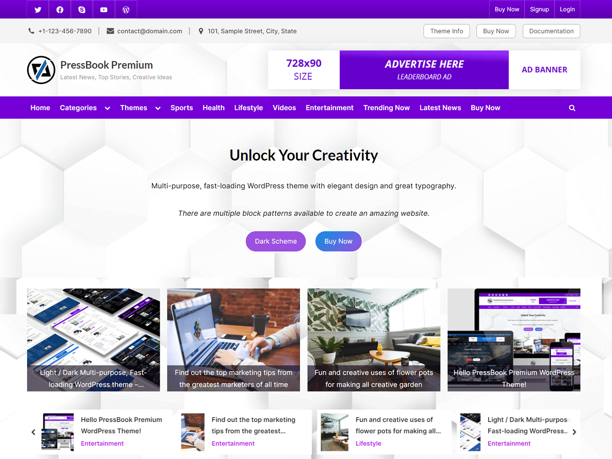
| Option Name | Value |
|---|---|
| Site Identity > Site Branding Layout (Large-Screen Devices) | Left – Right |
| Colors > Background Color | #ededed |
| Colors > Header Background Color | rgba(255,255,255,0.9) |
| Colors > Site Title Color | #404040 |
| Colors > Tagline Color | #979797 |
| Colors > Link Color | #b425ee |
| Colors > Link Hover Color | #7600d8 |
| Colors > Button Gradient Background 1 | #8422e6 |
| Colors > Button Gradient Background 2 | #b425ee |
| Colors > Button Text Color | #ffffff |
| Colors > Carousel Arrow Hover Background Color | #7600d8 |
| Colors > Carousel Arrow Hover Text Color | #ffffff |
| Fonts & Typography > Heading Font | Lato |
| Fonts & Typography > Body Font | Inter |
| Fonts & Typography > General Button: Padding Top | Default |
| Fonts & Typography > General Button: Padding Bottom | Default |
| Fonts & Typography > Read More Button: Padding Top | Default |
| Fonts & Typography > Read More Button: Padding Bottom | Default |
| Top Navbar > Top Navbar Design | Design – 1 |
| Top Navbar > Top Navbar Content Alignment (Large-Screen Devices) | Left – Right |
| Top Navbar > Top Navbar Gradient Background 1 | #5e00ad |
| Top Navbar > Top Navbar Gradient Background 2 | #7600d8 |
| Top Info Section > Top Info Background Color | #f3f3f3 |
| Top Info Section > Top Info Text Color | #515151 |
| Top Info Section > Top Info Font Weight | 600 |
| Top Info Section > Top Info: Button Background Color | #ffffff |
| Top Info Section > Top Info: Button Border Color | #a7a7a7 |
| Top Info Section > Top Info: Button Text Color | #515151 |
| Top Info Section > Top Info Button: Padding Top | 0.55em |
| Top Info Section > Top Info Button: Padding Bottom | 0.55em |
| Primary Navbar > Primary Navbar Design | Design – 1 |
| Primary Navbar > Primary Navbar Background Color | #7600d8 |
| Primary Navbar > Primary Navbar Hover Background Color | #ff4056 |
| Primary Navbar > Hide Top Border | Check |
| Primary Navbar > Primary Navbar Text Color | #ffffff |
| Content Layout > Content Background Color | #ffffff |
| Content Layout > Content Heading Color | #404040 |
| Content Layout > Content Text Color | #404040 |
| Sidebar Layout > Side Widget Background Color | #ffffff |
| Sidebar Layout > Side Widget Heading Color | #404040 |
| Sidebar Layout > Side Widget Text Color | #404040 |
| Sidebar Layout > Side Widget Border Color | #fafafa |
| Sidebar Layout > Side Widget Title Border Color | #7600d8 |
| Blog Options > Enable Show Blog Posts in a Grid | Uncheck |
| Blog Options > Use Masonry Layout | Uncheck |
| Blog Options > Post and Comment Meta Text Color | #979797 |
| Posts Carousel > Header Posts Carousel > Enable Header Posts Carousel | Check |
| Posts Carousel > Header Posts Carousel > Background Color | #ffffff |
| Posts Carousel > Header Posts Carousel > Text Color | #404040 |
| Posts Carousel > Footer Posts Carousel > Enable Footer Posts Carousel | Check |
| Posts Carousel > Footer Posts Carousel > Background Color | #ffffff |
| Posts Carousel > Footer Posts Carousel > Text Color | #404040 |
| Posts Carousel > Related Posts Carousel > Enable Related Posts Carousel | Check |
| Posts Grid > Header Posts Grid: Enable Header Posts Grid | Check |
| Posts Grid > Header Posts Grid > Empty Image Background Color | #e3e3e3 |
| Posts Grid > Header Posts Grid > Caption Background Color | rgba(12,0,22,0.6) |
| Posts Grid > Related Posts Grid: Enable Related Posts Grid | Check |
| Posts Grid > Related Posts Grid > Empty Image Background Color | #eeeeee |
| Posts Grid > Related Posts Grid > Caption Background Color | rgba(0,0,0,0.45) |
| Footer Options > Footer Widget Design | Design – 1 |
| Footer Options > Footer Background Color | rgba(255,255,255,0.88) |
| Footer Options > Footer Widget Text Color | #0a0a0a |
| Footer Options > Footer Widget Link Color | #7600d8 |
| Footer Options > Footer Widget Border Color | #cecece |
| Footer Options > Footer Copyright Text Color | #0a0a0a |
| Footer Options > Footer Credit Link Color | #7600d8 |
| Footer Options > Go To Top Hover Gradient Color 1 | #522db8 |
| Footer Options > Go To Top Hover Gradient Color 2 | #7600d8 |
9. Translation of the Theme
PressBook Premium theme is translation-ready. This means you can translate it to any other language. In order to do the actual translation, you may use the “Loco Translate” plugin and read the following guide on how to translate a WordPress theme into another language.
10. Frequently Asked Questions
You may also want to read the frequently asked questions related to the PressBook theme.