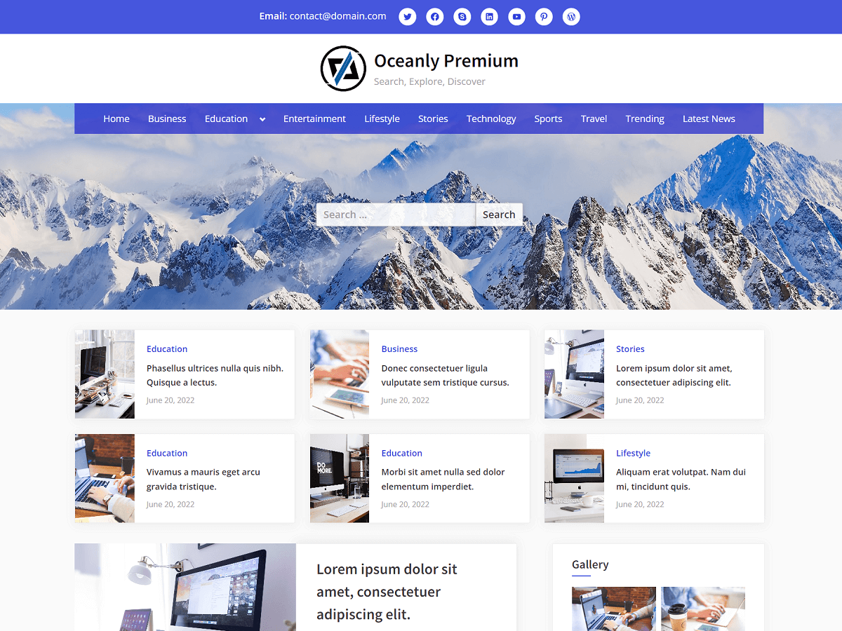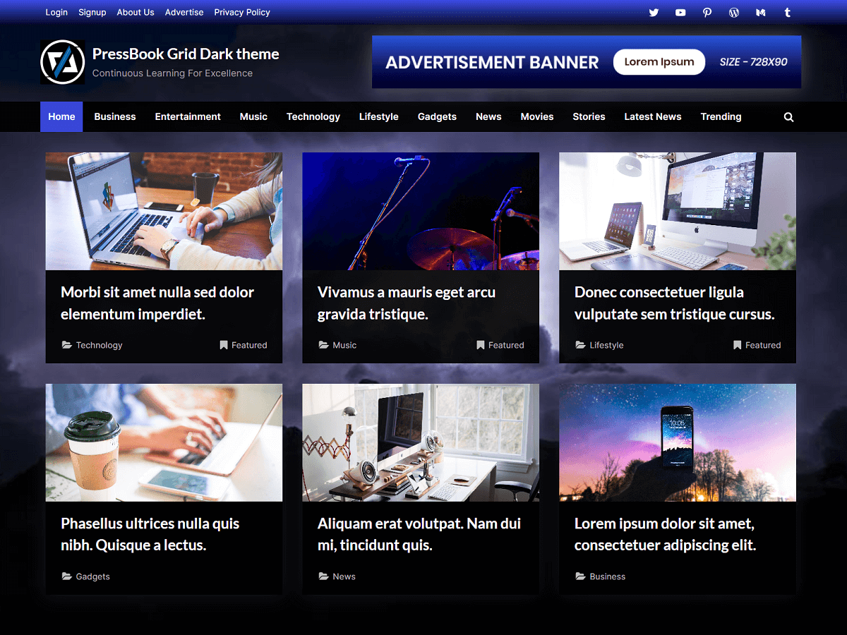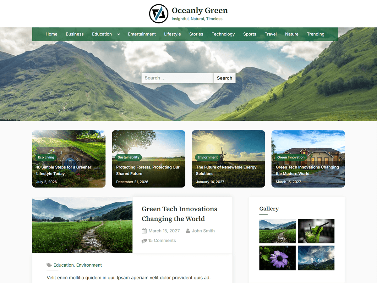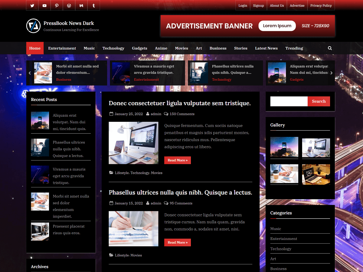

The following guide explains how to set up and configure the Oceanly Premium WordPress theme. It covers the main theme options, header, colors, menus, featured posts, widgets, footer, block areas, and options presets.
If you have any questions related to the theme, then you may reach out to us using our contact form. Also, you can refer to frequently asked questions.
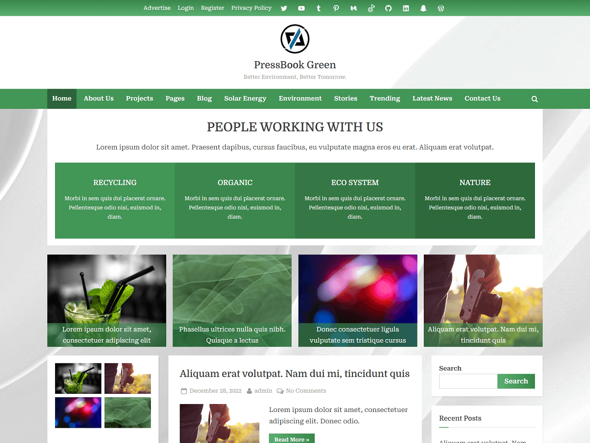
Oceanly Premium includes multiple menu locations, social links, featured and spotlight posts, colors option, light and dark color schemes, and advanced layout options.
Table of Content – Oceanly Premium Docs
- 1. Getting Started
- 2. Theme Options and Presets
- 3. Header Setup
- 3.1. Site Identity
- 3.2. Header Background
- 3.3. Top Header Bar
- 3.4. Header Social Links
- 3.5. Primary Navigation Menu
- 3.6. Breadcrumbs and Header Search Form
- 3.7. Featured Posts
- 3.8. Spotlight Posts
- 3.9. Header Block Areas
- 4. Colors, Fonts, General Options
- 5. Pages and Blog Posts
- 5.1. Hide the Page Title
- 5.2. Page Templates
- 5.3. Blog Layout
- 5.4. Read More Text
- 5.5. Related Posts
- 6. Sidebar and Footer Widgets
- 6.1. Widget Headings
- 6.2. Classic Widgets
- 6.3. Footer Widgets
- 6.4. Footer Menu and Footer Social Links
- 6.5. Footer Block Areas
- 7. Miscellaneous
1. Getting Started
After purchasing Oceanly Premium theme, download the theme ZIP file from your account panel under “Active Resources”.
In your WordPress admin area, go to:
Appearance > Themes > Add Theme > Upload Theme
Select the Oceanly Premium ZIP file and upload it.
After the installation, activate “Oceanly Premium” from Appearance > Themes
Once the theme is activated, you can use option presets (Appearance > Options Preset) and configure it from the WordPress Customizer (Appearance > Customize).
2. Theme Options and Presets
The main Oceanly Premium settings can be found under:
Appearance > Customize
This is where you can configure the site identity, hero header, colors, blog options, featured posts grid, spotlight posts grid, and other theme options.
For a quick setup, you can also use:
Appearance > Options Preset
The preset options are useful when you want to start with a ready-made color and layout configuration instead of setting every option manually. Oceanly Premium includes both light and dark color scheme presets.

3. Header Setup
The Oceanly Premium header includes the site branding area, top header bar, hero header, primary menu, social links, breadcrumbs, spotlight posts, featured posts, and block areas.

3.1. Site Identity
To configure your logo, site title, and tagline, go to:
Appearance > Customize > Site Identity
Oceanly Premium provides different alignment and sizing options for the branding area in:
Appearance > Customize > Header Branding
You can customize the branding for different screen sizes so that the header looks appropriate on desktop, tablet, and mobile devices.
For example, you can use the following settings:
Branding Alignment (Medium / Large Devices): Left
Logo Alignment (Medium / Large Devices): Top
Branding Alignment (Small Devices): Center
Logo Alignment (Small Devices): Top
The Branding Alignment option controls the position of the entire branding area, including the logo, site title, and tagline. You can align the branding area to the left, center, or right.
For logo size, you can use the built-in options. For example:
Logo Size (Large Devices): Extra Large
Logo Size (Medium Devices): Large
Logo Size (Small Devices): Large
If you need a custom logo size beyond the available options, you can use CSS. See Custom Logo Size Using CSS for more information.
3.2. Header Background / Hero Header
You can add or change the header background image from:
Appearance > Customize > Header Image
You can also configure the header background color from:
Appearance > Customize > Colors
Oceanly Premium supports a parallax-style header background and provides options for adjusting the header height. These options are available in:
Appearance > Customize > Hero Header
Use Enable Hero Header to show or hide the hero header.
When the hero header is disabled, the search form and breadcrumbs displayed within the hero header are also disabled.
When the hero header is disabled, you may want to add some space below the site header.
Use Site Header Bottom Margin to add the required bottom spacing.
Enable Enable Header Image Parallax Effect to add a parallax-style scrolling effect to the hero header background image. Disable this option when you prefer the background image to remain fixed in the normal header layout.
Use Header Image Background Position to control which part of the header background image is visible. This is useful when the important part of an image needs to remain visible on different screen sizes.
Use Header Image Background Size to control how the header background image is displayed within the hero header.
Use Hero Header Height to adjust the height of the hero header. You can increase or decrease the height to achieve the desired appearance for your header image.
3.3. Top Header Bar
Oceanly Premium theme supports a top header bar where you can display custom text and social links.
For the custom text, use the relevant options under:
Appearance > Customize > Header Top Bar
You are allowed to use anchor tags in Header Top Bar > Topbar Text.
For example:
<a href="#">Advertise</a>
<a href="#">Register</a>
<a href="#">Register</a>In the above text, replace ‘#’ with the actual links.
The top header bar can be used for a short message, announcement, contact information, or other text you want visitors to see above the main header. Oceanly Premium also supports social links in the header.
3.4. Header Social Links
You can display social links in the header using the social links menu.
Oceanly Premium theme supports the Social Links menu in both the header and footer.
Go to:
Appearance > Menus
Create a menu and add your social profiles as Custom Links.
For each item, enter the URL of your social profile and add it to the menu.
Then assign the menu to the Social Links Menu (Header) location.

The theme automatically displays the appropriate social icon for supported social links.
3.5. Primary Navigation Menu
To create the main navigation menu, go to:
Appearance > Menus
Create a menu, add pages, posts, categories, custom links, or other menu items, and assign it to the Primary Menu location.
Oceanly supports multi-level dropdown menus, so you can create submenus by placing menu items underneath a parent item.
The navigation menu can also be aligned according to the theme settings in:
Appearance > Customize > Main Navigation
3.6. Breadcrumbs and Header Search Form
Oceanly includes breadcrumb navigation that works as secondary navigation for archive and other pages.
You can enable or disable breadcrumb navigation:
Appearance > Customize > General Options > Show Header Breadcrumbs
The breadcrumb appearance can also be customized through the theme’s color options, including its RGBA color settings:
Appearance > Customize > Colors
- Breadcrumbs Background Color
- Breadcrumbs Text Color
- Breadcrumbs End (Last Item) Text Color
To show or hide the search form in the hero header, you can use the option:
Appearance > Customize > General Options > Show Header Search Form
3.7. Featured Posts
Oceanly Premium can display featured posts below the header.
To enable this feature, go to:
Appearance > Customize > Featured Posts
Enable Featured Posts and configure the source of the posts.

The featured images displayed in the Featued Posts section come from the Featured Image assigned to each post.
To add a featured image, edit a post and use:
Post > Featured image

This makes the featured image an important part of configuring the Featured Posts section.
3.8. Spotlight Posts
Oceanly Premium also supports a Spotlight Posts section for highlighting selected content.
You can configure this section from:
Appearance > Customize > Spotlight Posts
Select the source of the Spotlight Posts and configure the available options.

For example, you can use All Posts as the source if you want the theme to automatically select posts from your site.
The Spotlight Posts Count option controls how many posts are displayed.
You can also control the layout with Minimum Column Width (px). The number of columns automatically adjusts based on this value. Smaller values allow more columns, while larger values allow fewer columns.
The Column Height options let you adjust the height of the Spotlight Posts for different screen sizes, including extra large, large, medium, small, and extra small screens.
Other options are available to control the post title, label, date, content overlay, font weights, column fill mode, and image fit.
The featured images displayed in the Spotlight Posts section also come from the Featured Image assigned to each post.
3.9. Header Block Areas
Oceanly Premium provides header block areas for adding custom content such as sliders, shortcodes, images, and other WordPress blocks.
Go to:
Appearance > Customize > Header Block Area
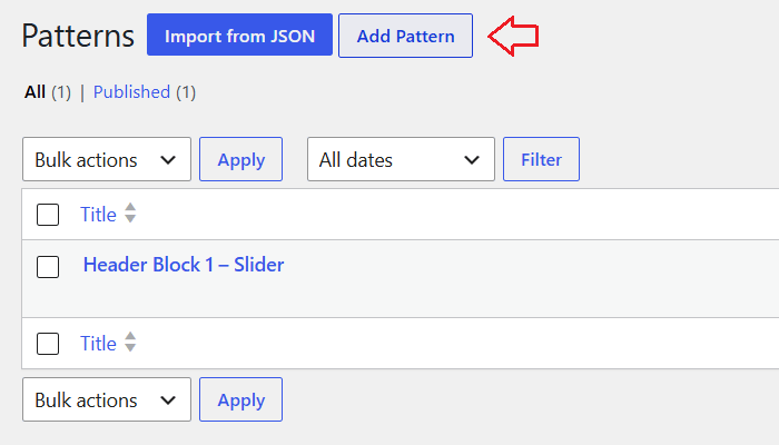
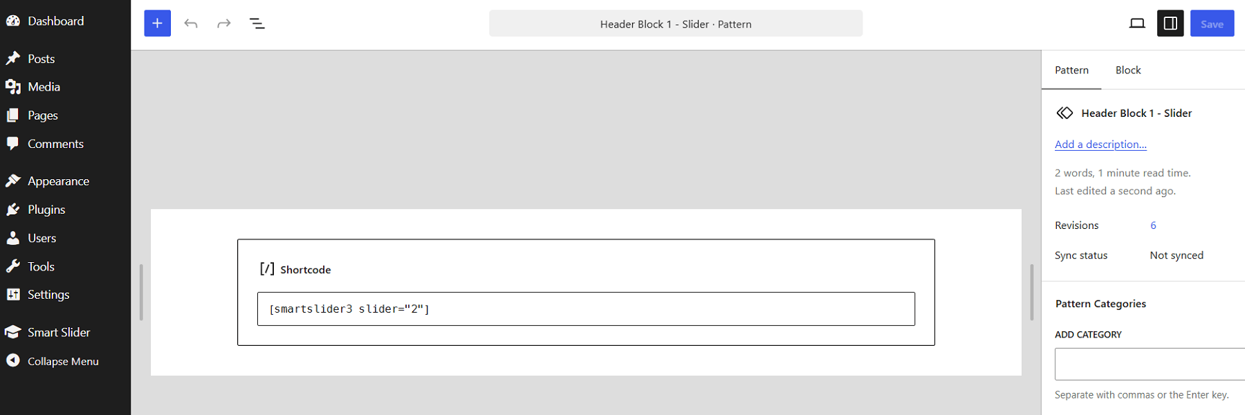
Create a new pattern block using the Pattern Blocks Manager. Then select the pattern block you created in the Header Block Area.
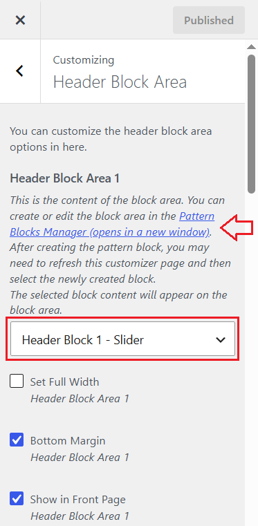
You can insert any custom content like shortcodes, blocks, images, etc. In the example screenshot below, we are placing slider shortcode from Smart Slider 3 plugin.
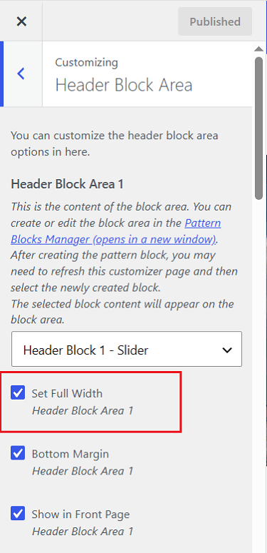
You can also configure where the block appears and whether it uses full width or contained width in Appearance > Customize > Header Block Area.
4. Colors, Fonts, General Options
Oceanly Premium supports both light and dark color schemes.
The easiest way to start with a color scheme is to use one of the presets available under:
Appearance > Options Preset
After applying a preset, you can further customize the colors from the Customizer. You can configure the main accent color and other theme colors from:
Appearance > Customize > Colors
The theme also supports RGBA colors for areas such as the main navigation and breadcrumbs.
Oceanly Premium supports Google Fonts for the website’s headings and body text.
You can select the available fonts from the options in the Customizer.
Appearance > Customize > General Options > Heading Font
Appearance > Customize > General Options > Body Font
The theme also supports locally hosted Google Fonts, which allows the fonts to be served from your own website.
Appearance > Customize > General Options > Load Fonts Locally
There are many other general options available such as:
- Hide Back to Top
- Blog Page Sidebar (Left Sidebar or Right Sidebar)
- Sticky Sidebar
- Enable Post Thumbnail Hover Effect
5. Pages and Blog Posts
Oceanly provides several options for controlling page layouts, blog layouts, sidebars, page titles, and post display.
5.1. Hide the Page Title
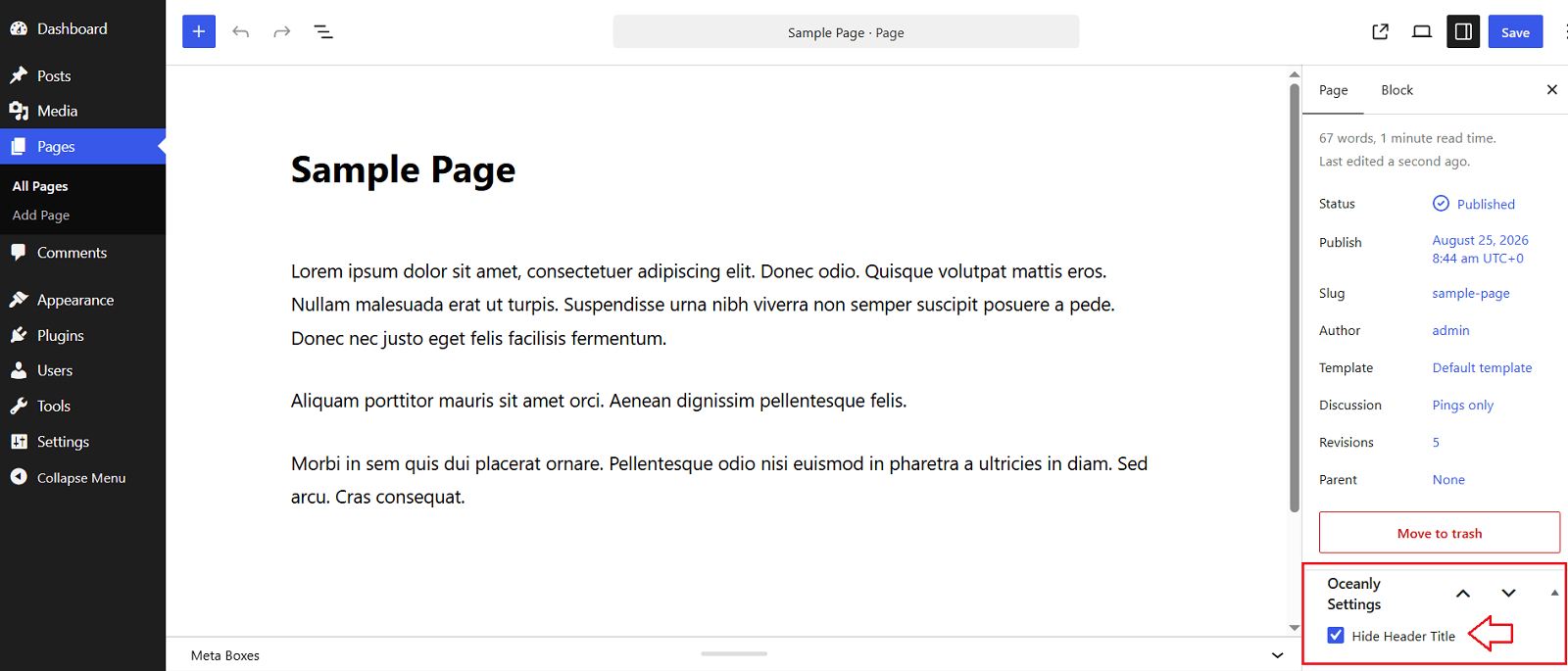
You can hide the title of an individual page from the page editor.
When editing a page, look for:
Oceanly Settings > Hide Header Title
5.2. Page Templates
When creating or editing a page, you can select a page template from the Template option in the page editor.
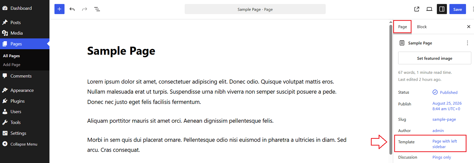
Oceanly supports different page layouts, including sidebar and full-width layouts.
For example, you can select:
Page with left sidebar
to display a left sidebar on that page.
5.3. Blog Layout
For blog posts, the sidebar position can be configured globally from:
Appearance > Customize > General Options > Blog Page Sidebar
You can choose the left or right sidebar layout as required.
When there is no active sidebar, you can change the blog content width from:
Appearance > Customize > General Options > Blog Page Width (No Sidebar)
Set it to Full when you want the posts to use the full available container width.
For blog posts, when theere is no active sidebar, the default setting is Compact.
5.4. Read More Text
You can change the text displayed on the blog post read-more button from:
Appearance > Customize > General Options > Read More Text
Enter your preferred text in this field.
You can leave the field empty if you want to use the default text.
5.4.1. Using the More Block
You can also control where the Read More link appears in a blog post by using the WordPress More block.
When editing a post, place the More block at the point where you want the post excerpt to end. Content before the More block will be shown on the blog/archive page, followed by the Read More link.
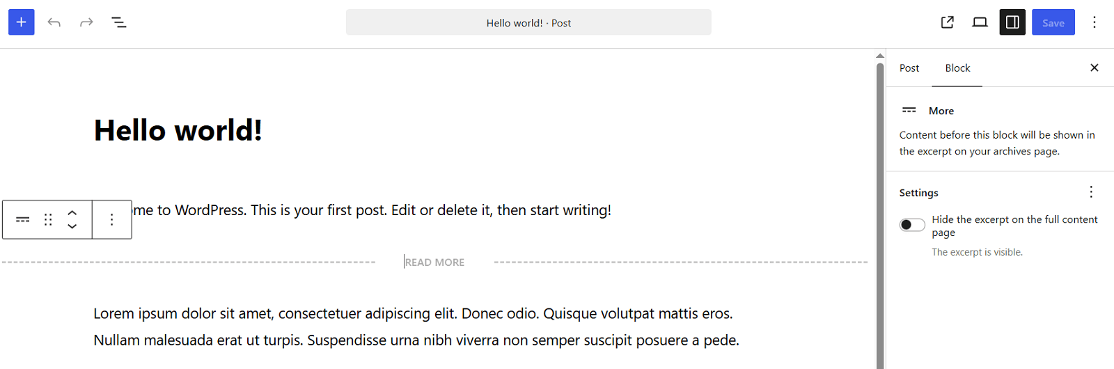
This is useful when you want to manually choose the point at which visitors should open the full post.
Note: The text displayed by the More block can be customized using the Read More Text option mentioned above.
5.5. Related Posts
Oceanly Premium supports related post content to help visitors discover additional articles.
Use the relevant related-post options under:
Appearance > Customize > Related Posts
to enable and configure the related posts display.
6. Sidebar and Footer Widgets
Oceanly uses WordPress widgets for the sidebar and footer areas.
You can manage the sidebar and footer widgets from:
Appearance > Widgets
Oceanly Premium provides a Main Sidebar widget area and six footer widget areas.
You can drag and arrange widgets or blocks within these areas.
The Main Sidebar widget area controls whether a sidebar is displayed on pages or posts that use a sidebar layout.
Important: The sidebar will not appear if there are no widgets placed in the Main Sidebar widget area. Add at least one widget or block to this area for the sidebar to be displayed.
6.1. Widget Headings
When using the block widgets screen, place a Group block inside the widget area.
Then add the heading (level H3 or H4) and the widget content inside the Group block.
For example:
- Group
- Heading H3
- Paragraph
- Image
- Group
- Heading H3
- Category List
Keeping the heading (level H3 or H4) and its content inside the Group block allows the theme to apply the widget heading styling correctly.
6.2. Classic Widgets
WordPress uses the block widgets screen by default. If you prefer the classic widgets interface, install and activate the Classic Widgets plugin.
Go to:
Plugins > Add Plugin
Search for Classic Widgets, then install and activate it.
6.3. Footer Widgets
Oceanly Premium provides six footer widget areas.
Go to:
Appearance > Widgets
and add widgets to the available footer areas.
The premium version also includes an option to control the number of footer widgets shown per row.
Appearance > Customize > Footer Widgets > Footer Widgets Per Row
6.4. Footer Menu and Footer Social Links
Oceanly Premium provides separate menu locations for a regular Footer Menu and a Social Links Menu (Footer).
6.4.1. Footer Menu
The Footer Menu is used to display regular navigation links horizontally in the footer.
Go to:
Appearance > Menus
Create a new menu and add the pages, custom links, categories, or other menu items you want to display.
Under Display location, select Footer Menu, then click Save Menu.
The menu will be displayed horizontally in the footer.
6.4.2. Footer Social Links
To display social media icons in the footer, create a separate menu using custom links.
Go to:
Appearance > Menus
Add each social profile as a Custom Link. Enter the social profile URL and link text, then click Add to Menu.
Under Display location, select Social Links Menu (Footer) and click Save Menu.
Oceanly Premium supports social links in both the header and footer.
6.5. Footer Block Areas
Similar to the header block areas, Oceanly Premium includes two footer block areas that can be used for custom content.
Go to:
Appearance > Footer Block Area
The steps for adding content to the footer block areas are similar to those for the header block areas:
Open the Pattern Blocks Manager and create a new pattern block containing your custom content such as banners, shortcodes, calls to action, or other WordPress blocks.
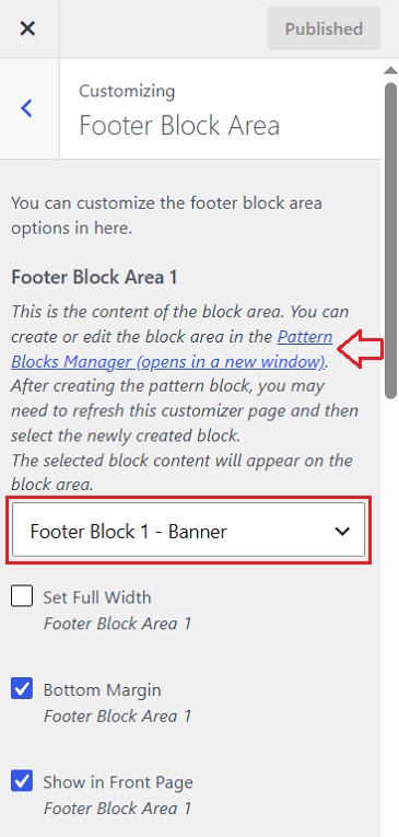
Go to Appearance > Footer Block Area and select the pattern block you created.
7. Miscellaneous
7.1. Customize List Styles in Widgets
Oceanly applies its own styling to lists inside widgets. For example, unordered lists within widgets may not display bullet points and may have a bottom border at the end of each item.
If you want to restore the browser’s default list styling or customize the spacing and appearance of widget lists, you can override the theme styles with custom CSS.
Go to:
Appearance > Customize > Additional CSS
Then add one of the following CSS snippets and click Publish.
Option 1: Restore Default List Styling in Widgets
Use this option when you want to remove the theme’s list styling and restore the default list appearance.
.widget ul,
.widget ol {
    padding: revert;
    margin: revert;
    list-style-position: revert;
}
.widget ul {
    list-style-type: revert;
}
.widget li > ul,
.widget li > ol {
    margin-left: revert;
}
.widget li:not(:first-child) {
    padding-top: revert;
}
.widget li:not(:last-child) {
    border-bottom: revert;
    padding-bottom: revert;
}
.widget li > ul > li:first-child,
.widget li > ol > li:first-child {
    padding-top: revert;
}
This can restore bullet points, list indentation, and the default spacing while removing the theme’s border and spacing styles.
Option 2: Use Custom Spacing
For more control over the list spacing, use the following CSS instead.
Remove the previous CSS before adding this version.
.widget ul,
.widget ol {
    margin: 0 0 1rem;
    padding-left: 1.5rem;
    list-style-position: outside;
}
.widget ul {
    list-style-type: revert;
}
.widget ol {
    list-style-type: revert;
}
.widget li {
    margin: 0;
    padding: .25rem 0;
}
.widget li > ul,
.widget li > ol {
    margin: .25rem 0 .25rem 1rem;
    padding-left: 1.5rem;
}
.widget li:not(:last-child) {
    border-bottom: none;
}
This version gives you more predictable control over indentation and vertical spacing while removing the border between widget list items.
Note: Use only one of the two CSS snippets at a time.
7.2. Custom Logo Size Using CSS
If the built-in logo size options in Appearance > Customize > Header Branding do not provide the exact size you need, you can use custom CSS to set the logo dimensions for different screen sizes.
Go to:
Appearance > Customize > Additional CSS
Add the following CSS:
.site-branding .custom-logo-link img {
    max-width: 250px;
    max-height: 90px
}
@media screen and (min-width: 576px) {
    .site-branding .custom-logo-link img {
        max-width: 280px;
        max-height: 95px
    }
}
@media screen and (min-width: 1200px) {
    .site-branding .custom-logo-link img {
        max-width: 300px;
        max-height: 100px;
    }
}
In the above CSS, change those values for small screen (250px, 90px), medium screen (280px, 95px), and large screen devices (300px, 100px).
For a circular logo, you can use the same value for max-width and max-height:
.site-branding .custom-logo-link img {
    max-width: 250px;
    max-height: 250px
}
@media screen and (min-width: 576px) {
    .site-branding .custom-logo-link img {
        max-width: 300px;
        max-height: 300px
    }
}
@media screen and (min-width: 1200px) {
    .site-branding .custom-logo-link img {
        max-width: 350px;
        max-height: 350px;
    }
}
You can adjust these values to make the logo smaller or larger on different screen sizes.